Revisiting Your Old Friends [Encore Publication]: Take a fresh look at your older images with new postprocessing

In today’s digital photography world, images are made as much in post-processing as they are in the camera.  We only get one chance at creating the image in the camera: the choices we make to compose the image, focus, expose, and fire the shutter at just the right moment are behind us the instant the shutter is released.  But the choices we make after the fact, using image processing software such as Adobe Lightroom, can be revisited as many times as we wish.  Because Lightroom is a non-destructive editor, meaning it keeps the original image file intact and just records the editing choices we make in its catalog, we can return to the image again and again, making slightly or entirely different choices.

When I return from a trip, I try to select the best raw image files and apply some post-processing within a few days.  That’s so I don’t agonize endlessly about creative choices, which would severely increase the turnaround time for sharing the images with the world.  But increasingly I find it is a good practice to return with a fresh eye to images I made some time ago, applying some different post-processing choices to render the image differently.

There are three scenarios under which I often revisit my older images:

      • The images are very old and were shot using film in the pre-digitial era.  In this scenario, scan the transparency (slide), negative, or print and then apply post-processing to the digital scan.

lr-00559_s_r13akqwcgmq0559

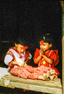
Here’s the original scan of a 35mm color slide (transparency) shot during a 1991 trek in Nepal’s Anapurna region.  The image is grainy and the background behind the girls’ heads is distracting.  I decided to clean it up a bit using Lightroom.

NepalWith just a few minutes of tweaking using Lightroom, I was able to crop the image for more dramatic impact, render a true black background, reduce the grainy noise in the shadow areas, and enhance the saturation of the colors.  Buy this photo

    • The images were shot digitally but were made before I started routinely using image-processing software such as Lightroom.  In these cases, I like to apply post-processing to see what artistic options I may have missed in the earlier digital years.

This old Scandinavian stave church was shot as a color image in 2005.  It is so high-contrast that it appears nearly monochromatic on the display screen.  It’s a striking image, but looking at it today I wondered how much more effective it would be as a true black-and-white photo, so I decided to revisit the image using Lightroom.

Here’s the same digital image file, but converted to black-and-white using Lightroom’s color channel processing module.  I boosted the contrast even further and then adjusted each color’s saturation in the black-and-white mix to achieve the exquisite texture of the snow on the ancient building’s roof.  Buy this photo

  • The images are more recent, but I want to make some new creative choices.  Here the idea is to render the image in a different way to achieve a different end result.  For example, an image I initially processed in color may turn out to make a lovely black-and-white photo.  Or perhaps I crop a crowd scene to emphasize just one or a few of the people within it.  The choices are nearly limitless.

Reviewing my favorite images from a recent trip to New Orleans, I saw this shot of a characteristic French Quarter balcony and realized it would be even more powerful if certain colors were more saturated.

A brief session in Lightroom’s Develop module was all it took to boost the saturation of the blue and red channels and to adjust the shadow and black point tonalities.  The resulting image more closely reproduces the emotional experience I recall when viewing this scene live.  Buy this photo

Take a look at some of your older images.  Which ones would you like to revisit and give a fresh new look?  Do you regularly return to work on your library of existing images?  Please share your thoughts here.

Want to read more posts about post-processing your images?  Find them all here: Posts on Post-Processing.

Brave New World [Encore Publication]: AI tools for photographers are improving

As a working professional photographer who also spent nearly 30 years as a technology manager/executive, I’ve long had an interest in the intersection between art/creativity and technology.  Recent attempts to marry photography with artificial intelligence have ranged from useful (facial recognition) to silly (Instagram filters) to hype (an expensive camera that several days after you shoot sends you only the images it deems worthy).  But as pattern matching algorithms improve and machine learning becomes more reliable, we are starting to see some amazing applications at the intersection of AI and photography.

I’ve recently been playing around with two good examples from Adobe.  Available only in the online version of Lightroom as “Technology Previews”, these tools enable you to search all your images for specific attributes and to have the AI automatically select what it determines to be your best photos.

To activate these new tools, go to https://lightroom.adobe.com, log in using your Adobe Creative Cloud credentials, and then click on the Lighroom logo in the upper left and select “Technology Previews” from the drop-down menu.  Click the check box next to “Best Photos”, and you’re good to go.

There are two main tools available at this time:

  1. Intelligent Photo Search: This is already very impressive technology.  You can search all or a subset of your images using any natural language term you want.  You could, for example, search all your images for photos of cats, or of mountains, or of dancers, or of waterfalls.  The more specific your search term is, the more accurate the results are likely to be.  When I searched for “waterfall” or for “dancer”, the AI seemed to get many or most of my photos featuring those themes, and only occasionally did it include photos that did not feature those themes.  When my search terms were broader, like “clouds” or “mountains”, the results were less accurate.  Aesthetic searches, say for the color “blue” or the effect of “motion” resulted in mostly accurate selections of images featuring these concepts.  While there are a few false matches, and likely quite a few more errors of omission of images that should have matched, this technology is quite useful in its current state.
  2. Best Photos Selection: This one is more of a work in process.  You can select any of your online galleries and ask the AI to select what it “thinks” the best photos are.  You can move a slider to increase or decrease how selective this tool is.  As a default, it shows you its picks for the top half of your photos, and then you can refine the selectivity to include more or fewer photos.  I tried this advanced technology using several of my recent photo galleries.  In most cases, it included my two or three favorite images in its initial selection of the top half of all the photos, but dropped them from its cut as I increased the selectivity.  In one gallery, for example, an image that was recently selected as a favorite by the editors of “National Geographic” was dropped by Adobe’s AI in the first cut of 10% of the images.  That image was quite artsy and abstract, and it’s not reasonable to expect that a machine could choose it as special.  Yet in another of my galleries, the AI included an image that recently won a major local competition in its final cut of just 1% of the images.  That image is a more traditional landscape that could reasonably be evaluated by a machine as a “good” photograph.

The bottom line here is that the applications of advanced technology to the art of photography are improving at an astonishing rate.  While neither of Adobe’s AI tools is as good as a human artist at selecting images by their features or their quality, both tools are off to an impressive start and one of them (Intelligent Photo Search) is already very usable.  I would not be surprised if, in a year or two, this technology advances to the point where machines can be making decisions about photography along with humans.  Both human and AI evaluations will have their strengths and weaknesses, and I can see them coexisting for the foreseeable future.  I recommend we all, as photographers, get steeped in this advanced technology and prepare for a future in which man and machine will both play a role in sophisticated evaluation of images.

Post-Processing without Post-Traumatic Stress [Encore Publication]: A pro’s case study on quick and simple workflow for large batches of images

As a working professional photographer, I wouldn’t trade my job for any other in the world.  I get to travel the world while capturing images of the diversity of cultures, landscapes, foods, events, and wildlife it has to offer.  And when I’m not traveling, I have the opportunity to document so many wonderful people and events in my own San Francisco Bay Area neighborhood.  Every job, not matter how wonderful, has its challenges.  In this digital age, we photographers are often faced with workflow challenges: how do we cull 10,000 images from a big shoot down to a manageable number, post-process the best ones so that they’ll look their best, and distribute them quickly to the client?  Today’s post offers one professional’s take on a quick and simple workflow that meets these challenges, delivering wonderful images to the client in a short period of time while (hopefully) preserving the sanity of the photographer.

I recently had the opportunity to capture two dress rehearsals and two performances of Dance Identity’s annual Spotlight production, showcasing 250 students and company dancers in 22 numbers.  I shot nearly 10,000 images, culled them down to about 700, post-processed, and delivered a gallery to the client, all within 24 hours of the final show.  Here’s how.

To illustrate the workflow, we’ll use as a case study the annual Spotlight production of local dance school and company Dance Identity.  To document their 250 dancers in 22 dance numbers, I shot both dress rehearsals and both performances, as well as capturing dancers backstage and during candid moments.  I captured some group shots of all the performers, instructors, and crew.  And to get the big picture, I even shot from the catwalks at the top of the theater down onto the stage.  In all, I shot nearly 10,000 images, which I culled to about 700 of the best photos, each of which required individual attention in post-processing.  I delivered a gallery with these top images to the client within 24 hours of the end of the final show.  Needless to say, without an efficient workflow this challenge would have been crushing.  Here’s how I did it.  The process I share here will be helpful for enthusiast photographers as well as pros.  It doesn’t matter whether you’re delivering your images to a paying client or to your friends and family.  When it’s crunch time and you have to turn around thousands of images from a shoot very quickly, this is a workflow that gets results.

Every image is different, but for large-scale shoots it is important to have a workflow that is streamlined so much of the processing can be done in an automated fashion.

Step 1: Culling Your Images

After each shoot, if there’s time before the next one starts, I review and begin to cull my images.  There are some advantages to culling on a bigger screen, but to save time during big events like Dance Identity’s Spotlight production, I cull right on my camera’s LCD screen.  Sure, some excellent images will be discarded using this approach, but with 10,000 images to get through quickly, it’s impractical to upload all of them to a PC and rank them all in a tool like Lightroom.  I zoom in on the images when required in order to get a closer look at focus, facial expressions, etc., and I use the camera’s histogram to check exposure.  I delete liberally as I go, keeping only the best images for a second review on the laptop.  In the case of the Dance Identity shoots, I culled in-camera from 10,000 down to about 1500 images.

With so many similar images to choose from, the culling process needs to be quick and dirty.  I do it using my camera’s LCD screen, transferring only the best images to the laptop for further culling and processing.

Step 2: Post-Processing

After culling down to a manageable number of images, but ensuring that the selected photos still represent all the dance numbers and all the performers, as well as a range of styles (group shots, motion shots, closeups, etc.), it’s time to post-process.  I use Lightroom nearly exclusively as the tool for this job when it’s a large-scale shoot.  Lightroom is optimized for the professional photographer’s workflow, and its presets, synchronization tools, and intuitive layout allow photographers to get the job done quickly and properly.

First, I import the selected images into Lightroom, using a preset to automatically adjust white balance, exposure, and noise reduction to the subject, in this case a fast-moving dance performance shot in an indoor theater.  For example, I use the import preset and/or synchronization capability in the Develop module to quickly apply noise reduction for all the shots made at high ISO settings (1600 and above).

Next, I turn off synchronization and go through each image individually in the Develop module, fine-tuning the settings for that specific image.  With many hundreds of images to fine-tune, I can only spend about thirty seconds on each one, so the workflow has to be very straightforward.  Typically I use the crop tool first, as this will be required for nearly every image.  I use the straightening tool within the crop toolset, selecting a line (such as a line on the stage or the bottom of the theater’s curtain) that I want to align with the top and bottom of the image.  Then I crop the image to highlight the subject in the most powerful way.  Sometimes I turn off the aspect ratio lock and set the image’s proportions manually, but most of the time I try to work with the aspect ratio as shot in the camera.  After straightening and cropping the image, I do some fine adjustments on the exposure and color settings, and then apply any needed effects such as post-crop vignetting or conversion to black-and-white.  Rarely, I may have to apply some selective adjustments such as brightening just one part of the image or removing a distracting background, but this slows down the workflow and should only be used when required.

Each image should be quickly straightened and cropped, then color and exposure settings (like the black point in the image above) can be applied to show the subject most effectively.  

Step 3: Delivering the Final Images

Once all the selected images have been processed, it’s time to deliver them to the client.  It can save time and simplify the workflow to use Lightroom’s Publish module to send your images directly to the platform you plan to use to deliver them.  My website is powered by SmugMug, which integrates well with Lightroom.  However, in the case of the Dance Identity shoots, I exported the top images to my PC’s hard drive, then uploaded the files from there to a new gallery on my website.  It’s your call as to which method you like to use.  In either case, once your final image files have been uploaded to your platform, it’s a good idea to apply security settings such as watermarking, right-click protection, and passwords to protect the images from misuse.  This is also the time to apply keywording so that you, your clients, and the public can find the images now and in the future.  Finally, communicate the availability of the final images, the access method, and the pricing to your client.

Delivering your images to a high quality platform quickly is a requirement to meet client needs in today’s world of fast-paced digital media.

So, there you have it: A quick but effective workflow to go from many thousands of raw images down to a few dozen or a few hundred beautifully processed photos, delivered to the client quickly and professionally.  And the best part is that you, the photographer, can retain at least some of your sanity in the process.  Of course, if you’re preparing fine art images for a major competition or exhibition, you’ll want to labor painstakingly over each one, hand-crafting every element of the image until you get it perfect.  But when you’ve got many, many raw images that need to be delivered promptly, this process is a workmanlike way to get the job done!

Take a bow!  You’ve married art with process engineering to deliver high-quality images to your client in a minimum amount of time.

Whether you’re a pro shooting for a paying client or an enthusiast shooting for family and friends, this basic workflow will get your images looking great and in the hands of those who want to see them in the shortest possible time.

What tips and tricks do your use when processing very large batches of images?  Please share your suggestions here!

Want to see more posts about image post-processing?  Find them all here: Posts about post-processing.
Calibration Time, Come On! [Encore Publication]: Why you should color-calibrate your display devices and how to do it

We tend to take for granted that the colors we perceive when we look at a scene will be captured faithfully by our camera’s sensor and the lens in front of it, and then rendered accurately in every stage of processing thereafter, from the memory card to the computer and to all our displays including laptops, tablets, smartphones, TVs, projectors, and even on these same types of displays owned by our friends with whom we share our images.  (We also expect prints made from our images to faithfully reproduce the colors from our camera’s sensor, but that is a story for another day.)

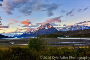
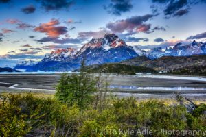
As photographers, we want to ensure the colors in our final images reflect as best we can the original colors we perceived when first framing the scene.  With proper color-calibration of the display screens we use to process our images, we can keep the colors as true and accurate as possible.  Buy this photo

The reality is that every step of the process of capturing, processing, and sharing an image leads to changes in the rendition of the colors.  No device can fully represent every intensity of every color that the human eye can see.  Camera manufacturers go to great lengths to ensure the colors captured by the camera’s sensor are as accurate as possible when you attach a lens made by the same company.  And when you use software such as Lightroom or Photoshop to post-process your images, you may take great pains to ensure the colors you see on your screen look very close to what you remember you saw when you shot the image in the first place.  But without careful attention, the final image we see later on our various display screens can look very different from device to device.  That’s because every type of display, and even every individual screen, has a unique way of representing every color.  So your PC’s monitor will display any given color just a bit differently than your phone’s screen will show that color.  And your friend’s phone’s screen will look a bit different, still (even if it’s the exact same brand and model as yours).

Fortunately, there is a simple and quite affordable way to standardize the representation of colors across all your devices.  It’s called color calibration, and for less than the cost of a good polarizing filter, say about $100, you can purchase a little doodad that can calibrate all your displays.  I use the X-Rite ColorMunki, which can be had for about $110 at retail.

To use a color calibration device, you install some software on your display(s) and then place the device on your display screen.  The software cycles the screen through displaying a wide range of colors, which are read and recorded by the calibration device.  Finally, the needed adjustments to bring your screen’s settings into line so they render colors as accurately as possible are saved in a special file.  From this point on, whenever your display device is started up, it reads the configuration information in that file and renders colors as closely to their actual appearance as it is physically capable of doing.

Because our eyes perceive colors differently in different ambient light conditions, you’ll want to have your calibration device take an ambient light reading for the typical lighting conditions that will be present while you’re using each display.  For example, if you use your laptop PC mostly when bright daylight is streaming into your kitchen, you’ll want to calibrate when those conditions are present.  You can even save different versions of the configuration file for different lighting conditions.

And because display devices do change over time, it’s a good idea to re-calibrate each device every few weeks to control for that.

If you’re serious about your photography, you want your images to look great not only on your own display screen(s), but also when viewed by other people on other types of devices or on the printed page.  Using a reliable color-calibration device helps ensure the colors in your images remain as accurate as possible through all the stages of processing and sharing until they leave your personal control.  This is a good practice that all photographers should employ.

How do you control for color accuracy in your images?  Please share your methods here!

Want to see other posts about post-processing your images?  Find them all here: Posts on Post-Processing.


When You Get Back Home [Encore Publication]: An introduction to the essentials of postprocessing

You may want to share some of your favorite images with friends and family right out of the camera while you’re still traveling, and as long as you’re not sharing so broadly that potential thieves may be alerted to your absence from home, that’s a fine thing to do.  To enable immediate and easy sharing, you can choose the setting available on many cameras to shoot both RAW and JPG files; the JPG images will often look pretty decent for sharing when they come straight from the camera, and you still have your much more detailed image data saved in the RAW files.

But when you get home from your trip, it’s worth making the effort to catalog and post-process the RAW files of your favorite images so that they will look their very best and so you will be organized for finding them in the future.  I’ll cover how to organize your catalog of images in a later post, but for now let’s take a look at the essentials of post-processing.

There are many software applications available to perform these tasks, but I strongly encourage you to check out Adobe Lightroom.  I use this tool, and nearly all professional and enthusiast photographers I know also use it.  You can license it along with other Adobe software on a pay-per-month basis as part of Adobe’s Creative Cloud, but it can also be purchased with a perpetual license (i.e., you purchase the software once and can use it forever), which is how I acquired it.

Once you have Lightroom installed on your PC, it’s easy to import your images from your camera’s memory card or from your PC’s hard drive and to organize your catalog of images using the software’s Library module.  When your images are in your Lightroom catalog, the software allows you to perform all post-processing you desire using its Develop module.  After shooting the image, my second-favorite part of the digital photography process is enhancing the the image in the Develop module.  The software package even gets its name, Lightroom, as the new digital equivalent of the work we older photographers formerly had to do in the darkroom, such as dodging, burning, and cropping our film negatives to get the images looking their best.

As an example of how a little post-processing can dramatically enhance an image, let’s take a look at a night shot I made of Copenhagen’s Christiansborg Palace, the seat of the Danish Parliament.  Here’s the “Before” picture:


Lightroom’s Develop module

The beauty of Lightroom’s method is that it doesn’t actually change your original image files as you edit them.  Instead Lightroom saves a roadmap of the various edits you make and stores this list of adjustments along with a pointer to the original file.  This is called “non-destructive editing”, and it allows you to edit your images to your heart’s content without overwriting or changing the originals at all.  You can go back as many times as you want later to revisit your edits and change them again and again.

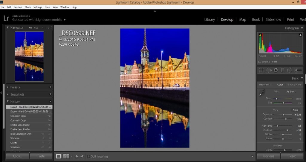
Let’s look at this process in more detail.  Here is the basic Lightroom Develop module screen:

lightroom develop module

The left bar shows a thumbnail of the image you’re working on and a list of the most recent edits you have made.  The central part of the screen shows a larger version of your image and this can be zoomed in and out to work on details or the whole image.  The right bar has a histogram (a graph showing how many pixels in the image are at each brightness level from totally black to totally white) at the top, then a toolbar from which you can choose some of the editing tools quickly, and then a large area with sliders (only some of which are shown in this screenshot) that you move left or right to adjust various elements of your image.  The editing tools in Lightroom are comprehensive enough that I find I very rarely need to import an image into Adobe Photoshop to make really sophisticated edits; nearly all of the time, I can perform all of my post-processing using only Lightroom.

Some photographers spend a lot of time making major enhancements to their images, but I like to try to adjust my camera’s settings precisely enough that the image is made in the camera the way I envisioned it when shooting, so that I need to make only minor adjustments in post-processing.  While the exact steps of post-processing will be different for every image, here is my basic workflow (note that for the most part, I work from the top to the bottom of the adjustment tools found in the right bar):

  1. Adjust the white balance as needed.  Remember my advice to always shoot in RAW mode.  One of the advantages of RAW files is that you can adjust the white balance in post-processing, regardless of what your camera’s white balance controls were set for while you were shooting the image.  In JPG files you have much less control over the white balance after the fact.  Just choose a different preset white balance type (such as Daylight, Shade, or Flash) from Lightroom’s menu, or create a custom white balance yourself.
  2. Adjust the exposure as needed.  Use the histogram and the image preview pane to lighten or darken the whole image until it looks best.
  3. Adjust the contrast as needed.  Increasing contrast gives more separation between the darkest and lightest portions of the image, while decreasing contrast does the opposite.  I find that most images require the contrast to be increased slightly to moderately.
  4. Adjust the highlights and shadows as needed.  Highlights are the brighter parts of the image, and I find that often these need to be reduced in brightness to regain some detail that may have been lost in the camera.  Shadows are the darker parts of the image, and often these need to be made brighter to bring out lost shadow detail.  After the highlights and shadows have been adjusted, you may need to adjust the whites and blacks (very brightest and very darkest points in your image) if there are extremes of contrast present.  Most of the time I do not need to change the white and black points.
  5. Adjust the clarity as needed.  The clarity slider changes the contrast of the middle tones (neither the darker nor the lighter parts) of the image.  Usually images need a subtle increase in clarity to bring out the details in the texture.  Don’t overuse this tool or the image can become unnatural looking.
  6. Adjust the vibrance and/or saturation as needed.  Both of these sliders will change the concentration of the colors in your image, but vibrance tries to avoid changing the color of skin tones so images with people will often look more natural after increasing the vibrance than after increasing saturation.  Occasionally you might need to make adjustments to both vibrance and saturation, but usually I find a subtle increase in vibrance is sufficient.  Again, don’t overuse these tools or your image will start to look exaggerated and surreal (unless you’re going for those effects).
  7. Adjust the concentration of individual colors as needed.  Each color channel has its own slider to increase or decrease its saturation.  I don’t use these sliders often, but occasionally you may want to increase or decrease the saturation of just a single color.  For example, when shooting a landscape with sky or water, you may want to increase the blue saturation to bring out those parts of the image.
  8. If you want to work on your image in black-and-white, the color channels area is the tool I use to do the conversion from color to monochrome.  Click on the “B&W” tab above the individual color channel sliders, and then adjust the mix of how the colors are blended by increasing or decreasing each color’s slider to see how the black-and-white image looks.  I find that I often have to readjust the contrast slider at this point to get the image looking its best in black-and-white.
  9. There is some sharpening already applied to your image file by default, but if it looks too soft in the important areas, you can dial in some additional sharpening.
  10. When the image you’re editing was shot at a high ISO (sensitivity) and/or a very long shutter speed, there will likely be some noise in the image.  This can be managed somewhat in Lightroom’s noise reduction tool.
  11. Under basic lens corrections I will usually select all three of the check box items.  Lightroom knows how most camera and lens combinations work and can eliminate many of the optical glitches that would otherwise show up in the image.  Under manual lens corrections, I may need to rotate the image if the horizon wasn’t level when it was shot.
  12. All of the above adjustments affect the entire image.  After completing these adjustments, it’s time to make any selective adjustments that affect only a selected part of the image.  These selective adjustment tools can be found in the toolbar just below the histogram.
  13. Of these selective adjustment tools, the most generally useful is the cropping tool, which of course allows you to remove unwanted portions of the image on the sides, top, or bottom.  It’s always best to try to compose the image correctly in the camera, but cropping is often still needed in post-processing.
  14. The spot removal, filters, and adjustment brush are more complicated selective adjustment tools that can easily be subjects of additional posts in their own right.

These steps usually won’t all be needed for any one image.  If you have several images that were shot under similar conditions, you can select them all in the Library module and turn on Auto Sync, which then allows you to make the adjustments only once and apply them to all the selected images.  Another big time saver is creating your own presets, which are saved routines that you can call at the click of a button to automate tasks that would otherwise have taken multiple steps.  Unlike Photoshop, Lightroom was designed by Adobe specifically for photographers to use, so it is set up in such a way as to make life much easier for us to organize, edit, and share our images.

Here is the “After” version of our sample image of Copenhagen by night.  You can see how a few simple edits during post-processing can really make an image pop.

Buy this photo

I hope you’ve found this very basic introduction to the essentials of post-processing to be helpful.  Now it’s your turn.  What are your go-to techniques in editing your images?  Do you have tips and tricks that you’ve found make your life easier after you return from a trip?  Please share your thoughts in the comment box at the end of this post.

Want to read more posts about post-processing your images?  Find them all here: Posts on Post-Processing.

Revisiting Your Old Friends [Encore Publication]: Take a fresh look at your older images with new postprocessing

In today’s digital photography world, images are made as much in post-processing as they are in the camera.  We only get one chance at creating the image in the camera: the choices we make to compose the image, focus, expose, and fire the shutter at just the right moment are behind us the instant the shutter is released.  But the choices we make after the fact, using image processing software such as Adobe Lightroom, can be revisited as many times as we wish.  Because Lightroom is a non-destructive editor, meaning it keeps the original image file intact and just records the editing choices we make in its catalog, we can return to the image again and again, making slightly or entirely different choices.

When I return from a trip, I try to select the best raw image files and apply some post-processing within a few days.  That’s so I don’t agonize endlessly about creative choices, which would severely increase the turnaround time for sharing the images with the world.  But increasingly I find it is a good practice to return with a fresh eye to images I made some time ago, applying some different post-processing choices to render the image differently.

There are three scenarios under which I often revisit my older images:

      • The images are very old and were shot using film in the pre-digitial era.  In this scenario, scan the transparency (slide), negative, or print and then apply post-processing to the digital scan.

lr-00559_s_r13akqwcgmq0559

Here’s the original scan of a 35mm color slide (transparency) shot during a 1991 trek in Nepal’s Anapurna region.  The image is grainy and the background behind the girls’ heads is distracting.  I decided to clean it up a bit using Lightroom.

NepalWith just a few minutes of tweaking using Lightroom, I was able to crop the image for more dramatic impact, render a true black background, reduce the grainy noise in the shadow areas, and enhance the saturation of the colors.  Buy this photo

    • The images were shot digitally but were made before I started routinely using image-processing software such as Lightroom.  In these cases, I like to apply post-processing to see what artistic options I may have missed in the earlier digital years.

This old Scandinavian stave church was shot as a color image in 2005.  It is so high-contrast that it appears nearly monochromatic on the display screen.  It’s a striking image, but looking at it today I wondered how much more effective it would be as a true black-and-white photo, so I decided to revisit the image using Lightroom.

Here’s the same digital image file, but converted to black-and-white using Lightroom’s color channel processing module.  I boosted the contrast even further and then adjusted each color’s saturation in the black-and-white mix to achieve the exquisite texture of the snow on the ancient building’s roof.  Buy this photo

  • The images are more recent, but I want to make some new creative choices.  Here the idea is to render the image in a different way to achieve a different end result.  For example, an image I initially processed in color may turn out to make a lovely black-and-white photo.  Or perhaps I crop a crowd scene to emphasize just one or a few of the people within it.  The choices are nearly limitless.

Reviewing my favorite images from a recent trip to New Orleans, I saw this shot of a characteristic French Quarter balcony and realized it would be even more powerful if certain colors were more saturated.

A brief session in Lightroom’s Develop module was all it took to boost the saturation of the blue and red channels and to adjust the shadow and black point tonalities.  The resulting image more closely reproduces the emotional experience I recall when viewing this scene live.  Buy this photo

Take a look at some of your older images.  Which ones would you like to revisit and give a fresh new look?  Do you regularly return to work on your library of existing images?  Please share your thoughts here.

Want to read more posts about post-processing your images?  Find them all here: Posts on Post-Processing.

Brave New World [Encore Publication]: AI tools for photographers are improving

As a working professional photographer who also spent nearly 30 years as a technology manager/executive, I’ve long had an interest in the intersection between art/creativity and technology.  Recent attempts to marry photography with artificial intelligence have ranged from useful (facial recognition) to silly (Instagram filters) to hype (an expensive camera that several days after you shoot sends you only the images it deems worthy).  But as pattern matching algorithms improve and machine learning becomes more reliable, we are starting to see some amazing applications at the intersection of AI and photography.

I’ve recently been playing around with two good examples from Adobe.  Available only in the online version of Lightroom as “Technology Previews”, these tools enable you to search all your images for specific attributes and to have the AI automatically select what it determines to be your best photos.

To activate these new tools, go to https://lightroom.adobe.com, log in using your Adobe Creative Cloud credentials, and then click on the Lighroom logo in the upper left and select “Technology Previews” from the drop-down menu.  Click the check box next to “Best Photos”, and you’re good to go.

There are two main tools available at this time:

  1. Intelligent Photo Search: This is already very impressive technology.  You can search all or a subset of your images using any natural language term you want.  You could, for example, search all your images for photos of cats, or of mountains, or of dancers, or of waterfalls.  The more specific your search term is, the more accurate the results are likely to be.  When I searched for “waterfall” or for “dancer”, the AI seemed to get many or most of my photos featuring those themes, and only occasionally did it include photos that did not feature those themes.  When my search terms were broader, like “clouds” or “mountains”, the results were less accurate.  Aesthetic searches, say for the color “blue” or the effect of “motion” resulted in mostly accurate selections of images featuring these concepts.  While there are a few false matches, and likely quite a few more errors of omission of images that should have matched, this technology is quite useful in its current state.
  2. Best Photos Selection: This one is more of a work in process.  You can select any of your online galleries and ask the AI to select what it “thinks” the best photos are.  You can move a slider to increase or decrease how selective this tool is.  As a default, it shows you its picks for the top half of your photos, and then you can refine the selectivity to include more or fewer photos.  I tried this advanced technology using several of my recent photo galleries.  In most cases, it included my two or three favorite images in its initial selection of the top half of all the photos, but dropped them from its cut as I increased the selectivity.  In one gallery, for example, an image that was recently selected as a favorite by the editors of “National Geographic” was dropped by Adobe’s AI in the first cut of 10% of the images.  That image was quite artsy and abstract, and it’s not reasonable to expect that a machine could choose it as special.  Yet in another of my galleries, the AI included an image that recently won a major local competition in its final cut of just 1% of the images.  That image is a more traditional landscape that could reasonably be evaluated by a machine as a “good” photograph.

The bottom line here is that the applications of advanced technology to the art of photography are improving at an astonishing rate.  While neither of Adobe’s AI tools is as good as a human artist at selecting images by their features or their quality, both tools are off to an impressive start and one of them (Intelligent Photo Search) is already very usable.  I would not be surprised if, in a year or two, this technology advances to the point where machines can be making decisions about photography along with humans.  Both human and AI evaluations will have their strengths and weaknesses, and I can see them coexisting for the foreseeable future.  I recommend we all, as photographers, get steeped in this advanced technology and prepare for a future in which man and machine will both play a role in sophisticated evaluation of images.

Post-Processing without Post-Traumatic Stress [Encore Publication]: A pro’s case study on quick and simple workflow for large batches of images

As a working professional photographer, I wouldn’t trade my job for any other in the world.  I get to travel the world while capturing images of the diversity of cultures, landscapes, foods, events, and wildlife it has to offer.  And when I’m not traveling, I have the opportunity to document so many wonderful people and events in my own San Francisco Bay Area neighborhood.  Every job, not matter how wonderful, has its challenges.  In this digital age, we photographers are often faced with workflow challenges: how do we cull 10,000 images from a big shoot down to a manageable number, post-process the best ones so that they’ll look their best, and distribute them quickly to the client?  Today’s post offers one professional’s take on a quick and simple workflow that meets these challenges, delivering wonderful images to the client in a short period of time while (hopefully) preserving the sanity of the photographer.

I recently had the opportunity to capture two dress rehearsals and two performances of Dance Identity’s annual Spotlight production, showcasing 250 students and company dancers in 22 numbers.  I shot nearly 10,000 images, culled them down to about 700, post-processed, and delivered a gallery to the client, all within 24 hours of the final show.  Here’s how.

To illustrate the workflow, we’ll use as a case study the annual Spotlight production of local dance school and company Dance Identity.  To document their 250 dancers in 22 dance numbers, I shot both dress rehearsals and both performances, as well as capturing dancers backstage and during candid moments.  I captured some group shots of all the performers, instructors, and crew.  And to get the big picture, I even shot from the catwalks at the top of the theater down onto the stage.  In all, I shot nearly 10,000 images, which I culled to about 700 of the best photos, each of which required individual attention in post-processing.  I delivered a gallery with these top images to the client within 24 hours of the end of the final show.  Needless to say, without an efficient workflow this challenge would have been crushing.  Here’s how I did it.  The process I share here will be helpful for enthusiast photographers as well as pros.  It doesn’t matter whether you’re delivering your images to a paying client or to your friends and family.  When it’s crunch time and you have to turn around thousands of images from a shoot very quickly, this is a workflow that gets results.

Every image is different, but for large-scale shoots it is important to have a workflow that is streamlined so much of the processing can be done in an automated fashion.

Step 1: Culling Your Images

After each shoot, if there’s time before the next one starts, I review and begin to cull my images.  There are some advantages to culling on a bigger screen, but to save time during big events like Dance Identity’s Spotlight production, I cull right on my camera’s LCD screen.  Sure, some excellent images will be discarded using this approach, but with 10,000 images to get through quickly, it’s impractical to upload all of them to a PC and rank them all in a tool like Lightroom.  I zoom in on the images when required in order to get a closer look at focus, facial expressions, etc., and I use the camera’s histogram to check exposure.  I delete liberally as I go, keeping only the best images for a second review on the laptop.  In the case of the Dance Identity shoots, I culled in-camera from 10,000 down to about 1500 images.

With so many similar images to choose from, the culling process needs to be quick and dirty.  I do it using my camera’s LCD screen, transferring only the best images to the laptop for further culling and processing.

Step 2: Post-Processing

After culling down to a manageable number of images, but ensuring that the selected photos still represent all the dance numbers and all the performers, as well as a range of styles (group shots, motion shots, closeups, etc.), it’s time to post-process.  I use Lightroom nearly exclusively as the tool for this job when it’s a large-scale shoot.  Lightroom is optimized for the professional photographer’s workflow, and its presets, synchronization tools, and intuitive layout allow photographers to get the job done quickly and properly.

First, I import the selected images into Lightroom, using a preset to automatically adjust white balance, exposure, and noise reduction to the subject, in this case a fast-moving dance performance shot in an indoor theater.  For example, I use the import preset and/or synchronization capability in the Develop module to quickly apply noise reduction for all the shots made at high ISO settings (1600 and above).

Next, I turn off synchronization and go through each image individually in the Develop module, fine-tuning the settings for that specific image.  With many hundreds of images to fine-tune, I can only spend about thirty seconds on each one, so the workflow has to be very straightforward.  Typically I use the crop tool first, as this will be required for nearly every image.  I use the straightening tool within the crop toolset, selecting a line (such as a line on the stage or the bottom of the theater’s curtain) that I want to align with the top and bottom of the image.  Then I crop the image to highlight the subject in the most powerful way.  Sometimes I turn off the aspect ratio lock and set the image’s proportions manually, but most of the time I try to work with the aspect ratio as shot in the camera.  After straightening and cropping the image, I do some fine adjustments on the exposure and color settings, and then apply any needed effects such as post-crop vignetting or conversion to black-and-white.  Rarely, I may have to apply some selective adjustments such as brightening just one part of the image or removing a distracting background, but this slows down the workflow and should only be used when required.

Each image should be quickly straightened and cropped, then color and exposure settings (like the black point in the image above) can be applied to show the subject most effectively.  

Step 3: Delivering the Final Images

Once all the selected images have been processed, it’s time to deliver them to the client.  It can save time and simplify the workflow to use Lightroom’s Publish module to send your images directly to the platform you plan to use to deliver them.  My website is powered by SmugMug, which integrates well with Lightroom.  However, in the case of the Dance Identity shoots, I exported the top images to my PC’s hard drive, then uploaded the files from there to a new gallery on my website.  It’s your call as to which method you like to use.  In either case, once your final image files have been uploaded to your platform, it’s a good idea to apply security settings such as watermarking, right-click protection, and passwords to protect the images from misuse.  This is also the time to apply keywording so that you, your clients, and the public can find the images now and in the future.  Finally, communicate the availability of the final images, the access method, and the pricing to your client.

Delivering your images to a high quality platform quickly is a requirement to meet client needs in today’s world of fast-paced digital media.

So, there you have it: A quick but effective workflow to go from many thousands of raw images down to a few dozen or a few hundred beautifully processed photos, delivered to the client quickly and professionally.  And the best part is that you, the photographer, can retain at least some of your sanity in the process.  Of course, if you’re preparing fine art images for a major competition or exhibition, you’ll want to labor painstakingly over each one, hand-crafting every element of the image until you get it perfect.  But when you’ve got many, many raw images that need to be delivered promptly, this process is a workmanlike way to get the job done!

Take a bow!  You’ve married art with process engineering to deliver high-quality images to your client in a minimum amount of time.

Whether you’re a pro shooting for a paying client or an enthusiast shooting for family and friends, this basic workflow will get your images looking great and in the hands of those who want to see them in the shortest possible time.

What tips and tricks do your use when processing very large batches of images?  Please share your suggestions here!

Want to see more posts about image post-processing?  Find them all here: Posts about post-processing.

Calibration Time, Come On! [Encore Publication]: Why you should color-calibrate your display devices and how to do it

We tend to take for granted that the colors we perceive when we look at a scene will be captured faithfully by our camera’s sensor and the lens in front of it, and then rendered accurately in every stage of processing thereafter, from the memory card to the computer and to all our displays including laptops, tablets, smartphones, TVs, projectors, and even on these same types of displays owned by our friends with whom we share our images.  (We also expect prints made from our images to faithfully reproduce the colors from our camera’s sensor, but that is a story for another day.)

As photographers, we want to ensure the colors in our final images reflect as best we can the original colors we perceived when first framing the scene.  With proper color-calibration of the display screens we use to process our images, we can keep the colors as true and accurate as possible.  Buy this photo

The reality is that every step of the process of capturing, processing, and sharing an image leads to changes in the rendition of the colors.  No device can fully represent every intensity of every color that the human eye can see.  Camera manufacturers go to great lengths to ensure the colors captured by the camera’s sensor are as accurate as possible when you attach a lens made by the same company.  And when you use software such as Lightroom or Photoshop to post-process your images, you may take great pains to ensure the colors you see on your screen look very close to what you remember you saw when you shot the image in the first place.  But without careful attention, the final image we see later on our various display screens can look very different from device to device.  That’s because every type of display, and even every individual screen, has a unique way of representing every color.  So your PC’s monitor will display any given color just a bit differently than your phone’s screen will show that color.  And your friend’s phone’s screen will look a bit different, still (even if it’s the exact same brand and model as yours).

Fortunately, there is a simple and quite affordable way to standardize the representation of colors across all your devices.  It’s called color calibration, and for less than the cost of a good polarizing filter, say about $100, you can purchase a little doodad that can calibrate all your displays.  I use the X-Rite ColorMunki, which can be had for about $110 at retail.

To use a color calibration device, you install some software on your display(s) and then place the device on your display screen.  The software cycles the screen through displaying a wide range of colors, which are read and recorded by the calibration device.  Finally, the needed adjustments to bring your screen’s settings into line so they render colors as accurately as possible are saved in a special file.  From this point on, whenever your display device is started up, it reads the configuration information in that file and renders colors as closely to their actual appearance as it is physically capable of doing.

Because our eyes perceive colors differently in different ambient light conditions, you’ll want to have your calibration device take an ambient light reading for the typical lighting conditions that will be present while you’re using each display.  For example, if you use your laptop PC mostly when bright daylight is streaming into your kitchen, you’ll want to calibrate when those conditions are present.  You can even save different versions of the configuration file for different lighting conditions.

And because display devices do change over time, it’s a good idea to re-calibrate each device every few weeks to control for that.

If you’re serious about your photography, you want your images to look great not only on your own display screen(s), but also when viewed by other people on other types of devices or on the printed page.  Using a reliable color-calibration device helps ensure the colors in your images remain as accurate as possible through all the stages of processing and sharing until they leave your personal control.  This is a good practice that all photographers should employ.

How do you control for color accuracy in your images?  Please share your methods here!

Want to see other posts about post-processing your images?  Find them all here: Posts on Post-Processing.


When You Get Back Home [Encore Publication]: An introduction to the essentials of postprocessing

You may want to share some of your favorite images with friends and family right out of the camera while you’re still traveling, and as long as you’re not sharing so broadly that potential thieves may be alerted to your absence from home, that’s a fine thing to do.  To enable immediate and easy sharing, you can choose the setting available on many cameras to shoot both RAW and JPG files; the JPG images will often look pretty decent for sharing when they come straight from the camera, and you still have your much more detailed image data saved in the RAW files.

But when you get home from your trip, it’s worth making the effort to catalog and post-process the RAW files of your favorite images so that they will look their very best and so you will be organized for finding them in the future.  I’ll cover how to organize your catalog of images in a later post, but for now let’s take a look at the essentials of post-processing.

There are many software applications available to perform these tasks, but I strongly encourage you to check out Adobe Lightroom.  I use this tool, and nearly all professional and enthusiast photographers I know also use it.  You can license it along with other Adobe software on a pay-per-month basis as part of Adobe’s Creative Cloud, but it can also be purchased with a perpetual license (i.e., you purchase the software once and can use it forever), which is how I acquired it.

Once you have Lightroom installed on your PC, it’s easy to import your images from your camera’s memory card or from your PC’s hard drive and to organize your catalog of images using the software’s Library module.  When your images are in your Lightroom catalog, the software allows you to perform all post-processing you desire using its Develop module.  After shooting the image, my second-favorite part of the digital photography process is enhancing the the image in the Develop module.  The software package even gets its name, Lightroom, as the new digital equivalent of the work we older photographers formerly had to do in the darkroom, such as dodging, burning, and cropping our film negatives to get the images looking their best.

As an example of how a little post-processing can dramatically enhance an image, let’s take a look at a night shot I made of Copenhagen’s Christiansborg Palace, the seat of the Danish Parliament.  Here’s the “Before” picture:


Lightroom’s Develop module

The beauty of Lightroom’s method is that it doesn’t actually change your original image files as you edit them.  Instead Lightroom saves a roadmap of the various edits you make and stores this list of adjustments along with a pointer to the original file.  This is called “non-destructive editing”, and it allows you to edit your images to your heart’s content without overwriting or changing the originals at all.  You can go back as many times as you want later to revisit your edits and change them again and again.

Let’s look at this process in more detail.  Here is the basic Lightroom Develop module screen:

lightroom develop module

The left bar shows a thumbnail of the image you’re working on and a list of the most recent edits you have made.  The central part of the screen shows a larger version of your image and this can be zoomed in and out to work on details or the whole image.  The right bar has a histogram (a graph showing how many pixels in the image are at each brightness level from totally black to totally white) at the top, then a toolbar from which you can choose some of the editing tools quickly, and then a large area with sliders (only some of which are shown in this screenshot) that you move left or right to adjust various elements of your image.  The editing tools in Lightroom are comprehensive enough that I find I very rarely need to import an image into Adobe Photoshop to make really sophisticated edits; nearly all of the time, I can perform all of my post-processing using only Lightroom.

Some photographers spend a lot of time making major enhancements to their images, but I like to try to adjust my camera’s settings precisely enough that the image is made in the camera the way I envisioned it when shooting, so that I need to make only minor adjustments in post-processing.  While the exact steps of post-processing will be different for every image, here is my basic workflow (note that for the most part, I work from the top to the bottom of the adjustment tools found in the right bar):

  1. Adjust the white balance as needed.  Remember my advice to always shoot in RAW mode.  One of the advantages of RAW files is that you can adjust the white balance in post-processing, regardless of what your camera’s white balance controls were set for while you were shooting the image.  In JPG files you have much less control over the white balance after the fact.  Just choose a different preset white balance type (such as Daylight, Shade, or Flash) from Lightroom’s menu, or create a custom white balance yourself.
  2. Adjust the exposure as needed.  Use the histogram and the image preview pane to lighten or darken the whole image until it looks best.
  3. Adjust the contrast as needed.  Increasing contrast gives more separation between the darkest and lightest portions of the image, while decreasing contrast does the opposite.  I find that most images require the contrast to be increased slightly to moderately.
  4. Adjust the highlights and shadows as needed.  Highlights are the brighter parts of the image, and I find that often these need to be reduced in brightness to regain some detail that may have been lost in the camera.  Shadows are the darker parts of the image, and often these need to be made brighter to bring out lost shadow detail.  After the highlights and shadows have been adjusted, you may need to adjust the whites and blacks (very brightest and very darkest points in your image) if there are extremes of contrast present.  Most of the time I do not need to change the white and black points.
  5. Adjust the clarity as needed.  The clarity slider changes the contrast of the middle tones (neither the darker nor the lighter parts) of the image.  Usually images need a subtle increase in clarity to bring out the details in the texture.  Don’t overuse this tool or the image can become unnatural looking.
  6. Adjust the vibrance and/or saturation as needed.  Both of these sliders will change the concentration of the colors in your image, but vibrance tries to avoid changing the color of skin tones so images with people will often look more natural after increasing the vibrance than after increasing saturation.  Occasionally you might need to make adjustments to both vibrance and saturation, but usually I find a subtle increase in vibrance is sufficient.  Again, don’t overuse these tools or your image will start to look exaggerated and surreal (unless you’re going for those effects).
  7. Adjust the concentration of individual colors as needed.  Each color channel has its own slider to increase or decrease its saturation.  I don’t use these sliders often, but occasionally you may want to increase or decrease the saturation of just a single color.  For example, when shooting a landscape with sky or water, you may want to increase the blue saturation to bring out those parts of the image.
  8. If you want to work on your image in black-and-white, the color channels area is the tool I use to do the conversion from color to monochrome.  Click on the “B&W” tab above the individual color channel sliders, and then adjust the mix of how the colors are blended by increasing or decreasing each color’s slider to see how the black-and-white image looks.  I find that I often have to readjust the contrast slider at this point to get the image looking its best in black-and-white.
  9. There is some sharpening already applied to your image file by default, but if it looks too soft in the important areas, you can dial in some additional sharpening.
  10. When the image you’re editing was shot at a high ISO (sensitivity) and/or a very long shutter speed, there will likely be some noise in the image.  This can be managed somewhat in Lightroom’s noise reduction tool.
  11. Under basic lens corrections I will usually select all three of the check box items.  Lightroom knows how most camera and lens combinations work and can eliminate many of the optical glitches that would otherwise show up in the image.  Under manual lens corrections, I may need to rotate the image if the horizon wasn’t level when it was shot.
  12. All of the above adjustments affect the entire image.  After completing these adjustments, it’s time to make any selective adjustments that affect only a selected part of the image.  These selective adjustment tools can be found in the toolbar just below the histogram.
  13. Of these selective adjustment tools, the most generally useful is the cropping tool, which of course allows you to remove unwanted portions of the image on the sides, top, or bottom.  It’s always best to try to compose the image correctly in the camera, but cropping is often still needed in post-processing.
  14. The spot removal, filters, and adjustment brush are more complicated selective adjustment tools that can easily be subjects of additional posts in their own right.

These steps usually won’t all be needed for any one image.  If you have several images that were shot under similar conditions, you can select them all in the Library module and turn on Auto Sync, which then allows you to make the adjustments only once and apply them to all the selected images.  Another big time saver is creating your own presets, which are saved routines that you can call at the click of a button to automate tasks that would otherwise have taken multiple steps.  Unlike Photoshop, Lightroom was designed by Adobe specifically for photographers to use, so it is set up in such a way as to make life much easier for us to organize, edit, and share our images.

Here is the “After” version of our sample image of Copenhagen by night.  You can see how a few simple edits during post-processing can really make an image pop.

Buy this photo

I hope you’ve found this very basic introduction to the essentials of post-processing to be helpful.  Now it’s your turn.  What are your go-to techniques in editing your images?  Do you have tips and tricks that you’ve found make your life easier after you return from a trip?  Please share your thoughts in the comment box at the end of this post.

Want to read more posts about post-processing your images?  Find them all here: Posts on Post-Processing.

Revisiting Your Old Friends [Encore Publication]: Take a fresh look at your older images with new postprocessing

In today’s digital photography world, images are made as much in post-processing as they are in the camera.  We only get one chance at creating the image in the camera: the choices we make to compose the image, focus, expose, and fire the shutter at just the right moment are behind us the instant the shutter is released.  But the choices we make after the fact, using image processing software such as Adobe Lightroom, can be revisited as many times as we wish.  Because Lightroom is a non-destructive editor, meaning it keeps the original image file intact and just records the editing choices we make in its catalog, we can return to the image again and again, making slightly or entirely different choices.

When I return from a trip, I try to select the best raw image files and apply some post-processing within a few days.  That’s so I don’t agonize endlessly about creative choices, which would severely increase the turnaround time for sharing the images with the world.  But increasingly I find it is a good practice to return with a fresh eye to images I made some time ago, applying some different post-processing choices to render the image differently.

There are three scenarios under which I often revisit my older images:

      • The images are very old and were shot using film in the pre-digitial era.  In this scenario, scan the transparency (slide), negative, or print and then apply post-processing to the digital scan.

lr-00559_s_r13akqwcgmq0559

Here’s the original scan of a 35mm color slide (transparency) shot during a 1991 trek in Nepal’s Anapurna region.  The image is grainy and the background behind the girls’ heads is distracting.  I decided to clean it up a bit using Lightroom.

NepalWith just a few minutes of tweaking using Lightroom, I was able to crop the image for more dramatic impact, render a true black background, reduce the grainy noise in the shadow areas, and enhance the saturation of the colors.  Buy this photo

    • The images were shot digitally but were made before I started routinely using image-processing software such as Lightroom.  In these cases, I like to apply post-processing to see what artistic options I may have missed in the earlier digital years.

This old Scandinavian stave church was shot as a color image in 2005.  It is so high-contrast that it appears nearly monochromatic on the display screen.  It’s a striking image, but looking at it today I wondered how much more effective it would be as a true black-and-white photo, so I decided to revisit the image using Lightroom.

Here’s the same digital image file, but converted to black-and-white using Lightroom’s color channel processing module.  I boosted the contrast even further and then adjusted each color’s saturation in the black-and-white mix to achieve the exquisite texture of the snow on the ancient building’s roof.  Buy this photo

  • The images are more recent, but I want to make some new creative choices.  Here the idea is to render the image in a different way to achieve a different end result.  For example, an image I initially processed in color may turn out to make a lovely black-and-white photo.  Or perhaps I crop a crowd scene to emphasize just one or a few of the people within it.  The choices are nearly limitless.

Reviewing my favorite images from a recent trip to New Orleans, I saw this shot of a characteristic French Quarter balcony and realized it would be even more powerful if certain colors were more saturated.

A brief session in Lightroom’s Develop module was all it took to boost the saturation of the blue and red channels and to adjust the shadow and black point tonalities.  The resulting image more closely reproduces the emotional experience I recall when viewing this scene live.  Buy this photo

Take a look at some of your older images.  Which ones would you like to revisit and give a fresh new look?  Do you regularly return to work on your library of existing images?  Please share your thoughts here.

Want to read more posts about post-processing your images?  Find them all here: Posts on Post-Processing.

Black-and-White to the Rescue [Encore Publication]: Converting a noisy or strangely colored image to monochrome can save the day

In a recent post (Post on Circus Automatic), I shared several practical tips for shooting fast-moving indoor performances, using a circus performance as an example.  While I was happy with many of my images from that evening’s shoot, I discussed how the single-colored LED lights now used at many indoor performances can impart an unnatural color cast to photos that can be hard to correct in post-processing.  In today’s post, I show how converting these images to black-and-white can overcome some of the limitations of shooting under these adverse lighting conditions, with the added bonus that the noise imparted to the images (from having to shoot at a very high ISO setting) can also be less noticeable in black-and-white conversions.

First, a little background explanation on why these LED lights are so troublesome for the photographer to work with.  When we refer to the resolution, or number of pixels, in our camera’s sensor, that number is actually the total count of three different kinds of pixels, each kind sensitive to only one of the three primary colors (red, blue, and green).  Without going into the nitty-gritty technical details, suffice it to say that in most camera sensors, about 50% of the pixels record only green data, about 25% only red data, and about 25% only blue data.  My camera (the Nikon D810) is said to have a resolution of 36.3 megapixels (MP), but if my subject is lit by a single-colored red LED, in reality only about 9 MP of resolution is recorded.  The other two color channels will essentially contain no data.  This is bad for several reasons, most notably because the image will be cast unnaturally toward the red color channel and because its effective resolution will be low.

There’s very little we can do in post-processing to recover from the loss of resolution during capture, but we can adjust the color temperature to try to correct a little bit of the strange color cast.  Converting the image to black-and-white, though, can restore the image to a more natural appearance by masking the color cast.  This can be aided by using Lightroom’s contrast and color control sliders to adjust the balance of the black-and-white version until it appears closest to a normal tone.

Consider the following two versions of the same shot.  The first version is in color, and even after adjusting the color temperature and contrast, there is still a distracting red color cast.  There is also some noise apparent in the image as a result of the high ISO setting required to freeze the acrobats’ motion.

The color version of this image appears unnatural even after adjusting color temperature, due to the lighting which consisted of a red-colored LED array.

Now, take a look at the black-and-white version of the same image.  Creating this version required careful attention to the balance of each color and contrast setting to make the final image.  The good news: the monochrome image appears much more natural to the eye than does the color version.  The skin tones seem less artificial, and the curtain in the background does not distract as much.  Furthermore, there is less noise apparent in the black-and-white version.
The same shot appears more natural and less noisy when converted to a black-and-white photo.  Buy this photo

This next shot appears much more acceptable in its color version.  During a live performance, the lighting often changes drastically from one moment to the next, and in this image the LED lights didn’t impart as harsh a red cast as in the previous image.  Furthermore, the aerialist was dressed entirely in red and was working with red ropes, so what red color cast was present does not appear as unnatural.

This image is highly effective when presented in full color.  Buy this photo

While I like this image for its dramatic power and strikingly vibrant red colors, let’s take a look at a black-and-white conversion for comparison.  The monochrome version lacks the visceral impact of the strident red color, but it benefits from a more natural tone, a quasi-documentary look and feel, and a nice clean black background.  In this case, the black-and-white conversion doesn’t so much rescue the image as change the kind of feeling it elicits.  I like both versions.
The black-and-white version is cleaner and evokes a very different set of emotions than does the color version.  Buy this photo

When you are forced to shoot under very difficult lighting conditions, try converting to black-and-white during post-processing.  It just might rescue some of your images and can evoke a very different feel in other images.

For a refresher on the black-and-white conversion process and when you may want to use it, read this post: Post on B&W Conversion.

During post-processing, have you been able to rescue or improve images shot under challenging lighting conditions?  Did you convert to black-and-white, or use different techniques?  Please share your experiences here.

Brave New World [Encore Publication]: AI tools for photographers are improving

As a working professional photographer who also spent nearly 30 years as a technology manager/executive, I’ve long had an interest in the intersection between art/creativity and technology.  Recent attempts to marry photography with artificial intelligence have ranged from useful (facial recognition) to silly (Instagram filters) to hype (an expensive camera that several days after you shoot sends you only the images it deems worthy).  But as pattern matching algorithms improve and machine learning becomes more reliable, we are starting to see some amazing applications at the intersection of AI and photography.

I’ve recently been playing around with two good examples from Adobe.  Available only in the online version of Lightroom as “Technology Previews”, these tools enable you to search all your images for specific attributes and to have the AI automatically select what it determines to be your best photos.

To activate these new tools, go to https://lightroom.adobe.com, log in using your Adobe Creative Cloud credentials, and then click on the Lighroom logo in the upper left and select “Technology Previews” from the drop-down menu.  Click the check box next to “Best Photos”, and you’re good to go.

There are two main tools available at this time:

  1. Intelligent Photo Search: This is already very impressive technology.  You can search all or a subset of your images using any natural language term you want.  You could, for example, search all your images for photos of cats, or of mountains, or of dancers, or of waterfalls.  The more specific your search term is, the more accurate the results are likely to be.  When I searched for “waterfall” or for “dancer”, the AI seemed to get many or most of my photos featuring those themes, and only occasionally did it include photos that did not feature those themes.  When my search terms were broader, like “clouds” or “mountains”, the results were less accurate.  Aesthetic searches, say for the color “blue” or the effect of “motion” resulted in mostly accurate selections of images featuring these concepts.  While there are a few false matches, and likely quite a few more errors of omission of images that should have matched, this technology is quite useful in its current state.
  2. Best Photos Selection: This one is more of a work in process.  You can select any of your online galleries and ask the AI to select what it “thinks” the best photos are.  You can move a slider to increase or decrease how selective this tool is.  As a default, it shows you its picks for the top half of your photos, and then you can refine the selectivity to include more or fewer photos.  I tried this advanced technology using several of my recent photo galleries.  In most cases, it included my two or three favorite images in its initial selection of the top half of all the photos, but dropped them from its cut as I increased the selectivity.  In one gallery, for example, an image that was recently selected as a favorite by the editors of “National Geographic” was dropped by Adobe’s AI in the first cut of 10% of the images.  That image was quite artsy and abstract, and it’s not reasonable to expect that a machine could choose it as special.  Yet in another of my galleries, the AI included an image that recently won a major local competition in its final cut of just 1% of the images.  That image is a more traditional landscape that could reasonably be evaluated by a machine as a “good” photograph.

The bottom line here is that the applications of advanced technology to the art of photography are improving at an astonishing rate.  While neither of Adobe’s AI tools is as good as a human artist at selecting images by their features or their quality, both tools are off to an impressive start and one of them (Intelligent Photo Search) is already very usable.  I would not be surprised if, in a year or two, this technology advances to the point where machines can be making decisions about photography along with humans.  Both human and AI evaluations will have their strengths and weaknesses, and I can see them coexisting for the foreseeable future.  I recommend we all, as photographers, get steeped in this advanced technology and prepare for a future in which man and machine will both play a role in sophisticated evaluation of images.

Post-Processing without Post-Traumatic Stress [Encore Publication]: A pro’s case study on quick and simple workflow for large batches of images

As a working professional photographer, I wouldn’t trade my job for any other in the world.  I get to travel the world while capturing images of the diversity of cultures, landscapes, foods, events, and wildlife it has to offer.  And when I’m not traveling, I have the opportunity to document so many wonderful people and events in my own San Francisco Bay Area neighborhood.  Every job, not matter how wonderful, has its challenges.  In this digital age, we photographers are often faced with workflow challenges: how do we cull 10,000 images from a big shoot down to a manageable number, post-process the best ones so that they’ll look their best, and distribute them quickly to the client?  Today’s post offers one professional’s take on a quick and simple workflow that meets these challenges, delivering wonderful images to the client in a short period of time while (hopefully) preserving the sanity of the photographer.

I recently had the opportunity to capture two dress rehearsals and two performances of Dance Identity’s annual Spotlight production, showcasing 250 students and company dancers in 22 numbers.  I shot nearly 10,000 images, culled them down to about 700, post-processed, and delivered a gallery to the client, all within 24 hours of the final show.  Here’s how.

To illustrate the workflow, we’ll use as a case study the annual Spotlight production of local dance school and company Dance Identity.  To document their 250 dancers in 22 dance numbers, I shot both dress rehearsals and both performances, as well as capturing dancers backstage and during candid moments.  I captured some group shots of all the performers, instructors, and crew.  And to get the big picture, I even shot from the catwalks at the top of the theater down onto the stage.  In all, I shot nearly 10,000 images, which I culled to about 700 of the best photos, each of which required individual attention in post-processing.  I delivered a gallery with these top images to the client within 24 hours of the end of the final show.  Needless to say, without an efficient workflow this challenge would have been crushing.  Here’s how I did it.  The process I share here will be helpful for enthusiast photographers as well as pros.  It doesn’t matter whether you’re delivering your images to a paying client or to your friends and family.  When it’s crunch time and you have to turn around thousands of images from a shoot very quickly, this is a workflow that gets results.

Every image is different, but for large-scale shoots it is important to have a workflow that is streamlined so much of the processing can be done in an automated fashion.

Step 1: Culling Your Images

After each shoot, if there’s time before the next one starts, I review and begin to cull my images.  There are some advantages to culling on a bigger screen, but to save time during big events like Dance Identity’s Spotlight production, I cull right on my camera’s LCD screen.  Sure, some excellent images will be discarded using this approach, but with 10,000 images to get through quickly, it’s impractical to upload all of them to a PC and rank them all in a tool like Lightroom.  I zoom in on the images when required in order to get a closer look at focus, facial expressions, etc., and I use the camera’s histogram to check exposure.  I delete liberally as I go, keeping only the best images for a second review on the laptop.  In the case of the Dance Identity shoots, I culled in-camera from 10,000 down to about 1500 images.

With so many similar images to choose from, the culling process needs to be quick and dirty.  I do it using my camera’s LCD screen, transferring only the best images to the laptop for further culling and processing.

Step 2: Post-Processing

After culling down to a manageable number of images, but ensuring that the selected photos still represent all the dance numbers and all the performers, as well as a range of styles (group shots, motion shots, closeups, etc.), it’s time to post-process.  I use Lightroom nearly exclusively as the tool for this job when it’s a large-scale shoot.  Lightroom is optimized for the professional photographer’s workflow, and its presets, synchronization tools, and intuitive layout allow photographers to get the job done quickly and properly.

First, I import the selected images into Lightroom, using a preset to automatically adjust white balance, exposure, and noise reduction to the subject, in this case a fast-moving dance performance shot in an indoor theater.  For example, I use the import preset and/or synchronization capability in the Develop module to quickly apply noise reduction for all the shots made at high ISO settings (1600 and above).

Next, I turn off synchronization and go through each image individually in the Develop module, fine-tuning the settings for that specific image.  With many hundreds of images to fine-tune, I can only spend about thirty seconds on each one, so the workflow has to be very straightforward.  Typically I use the crop tool first, as this will be required for nearly every image.  I use the straightening tool within the crop toolset, selecting a line (such as a line on the stage or the bottom of the theater’s curtain) that I want to align with the top and bottom of the image.  Then I crop the image to highlight the subject in the most powerful way.  Sometimes I turn off the aspect ratio lock and set the image’s proportions manually, but most of the time I try to work with the aspect ratio as shot in the camera.  After straightening and cropping the image, I do some fine adjustments on the exposure and color settings, and then apply any needed effects such as post-crop vignetting or conversion to black-and-white.  Rarely, I may have to apply some selective adjustments such as brightening just one part of the image or removing a distracting background, but this slows down the workflow and should only be used when required.

Each image should be quickly straightened and cropped, then color and exposure settings (like the black point in the image above) can be applied to show the subject most effectively.  

Step 3: Delivering the Final Images

Once all the selected images have been processed, it’s time to deliver them to the client.  It can save time and simplify the workflow to use Lightroom’s Publish module to send your images directly to the platform you plan to use to deliver them.  My website is powered by SmugMug, which integrates well with Lightroom.  However, in the case of the Dance Identity shoots, I exported the top images to my PC’s hard drive, then uploaded the files from there to a new gallery on my website.  It’s your call as to which method you like to use.  In either case, once your final image files have been uploaded to your platform, it’s a good idea to apply security settings such as watermarking, right-click protection, and passwords to protect the images from misuse.  This is also the time to apply keywording so that you, your clients, and the public can find the images now and in the future.  Finally, communicate the availability of the final images, the access method, and the pricing to your client.

Delivering your images to a high quality platform quickly is a requirement to meet client needs in today’s world of fast-paced digital media.

So, there you have it: A quick but effective workflow to go from many thousands of raw images down to a few dozen or a few hundred beautifully processed photos, delivered to the client quickly and professionally.  And the best part is that you, the photographer, can retain at least some of your sanity in the process.  Of course, if you’re preparing fine art images for a major competition or exhibition, you’ll want to labor painstakingly over each one, hand-crafting every element of the image until you get it perfect.  But when you’ve got many, many raw images that need to be delivered promptly, this process is a workmanlike way to get the job done!

Take a bow!  You’ve married art with process engineering to deliver high-quality images to your client in a minimum amount of time.

Whether you’re a pro shooting for a paying client or an enthusiast shooting for family and friends, this basic workflow will get your images looking great and in the hands of those who want to see them in the shortest possible time.

What tips and tricks do your use when processing very large batches of images?  Please share your suggestions here!

Want to see more posts about image post-processing?  Find them all here: Posts about post-processing.

Calibration Time, Come On! [Encore Publication]: Why you should color-calibrate your display devices and how to do it

We tend to take for granted that the colors we perceive when we look at a scene will be captured faithfully by our camera’s sensor and the lens in front of it, and then rendered accurately in every stage of processing thereafter, from the memory card to the computer and to all our displays including laptops, tablets, smartphones, TVs, projectors, and even on these same types of displays owned by our friends with whom we share our images.  (We also expect prints made from our images to faithfully reproduce the colors from our camera’s sensor, but that is a story for another day.)

As photographers, we want to ensure the colors in our final images reflect as best we can the original colors we perceived when first framing the scene.  With proper color-calibration of the display screens we use to process our images, we can keep the colors as true and accurate as possible.  Buy this photo

The reality is that every step of the process of capturing, processing, and sharing an image leads to changes in the rendition of the colors.  No device can fully represent every intensity of every color that the human eye can see.  Camera manufacturers go to great lengths to ensure the colors captured by the camera’s sensor are as accurate as possible when you attach a lens made by the same company.  And when you use software such as Lightroom or Photoshop to post-process your images, you may take great pains to ensure the colors you see on your screen look very close to what you remember you saw when you shot the image in the first place.  But without careful attention, the final image we see later on our various display screens can look very different from device to device.  That’s because every type of display, and even every individual screen, has a unique way of representing every color.  So your PC’s monitor will display any given color just a bit differently than your phone’s screen will show that color.  And your friend’s phone’s screen will look a bit different, still (even if it’s the exact same brand and model as yours).

Fortunately, there is a simple and quite affordable way to standardize the representation of colors across all your devices.  It’s called color calibration, and for less than the cost of a good polarizing filter, say about $100, you can purchase a little doodad that can calibrate all your displays.  I use the X-Rite ColorMunki, which can be had for about $110 at retail.

To use a color calibration device, you install some software on your display(s) and then place the device on your display screen.  The software cycles the screen through displaying a wide range of colors, which are read and recorded by the calibration device.  Finally, the needed adjustments to bring your screen’s settings into line so they render colors as accurately as possible are saved in a special file.  From this point on, whenever your display device is started up, it reads the configuration information in that file and renders colors as closely to their actual appearance as it is physically capable of doing.

Because our eyes perceive colors differently in different ambient light conditions, you’ll want to have your calibration device take an ambient light reading for the typical lighting conditions that will be present while you’re using each display.  For example, if you use your laptop PC mostly when bright daylight is streaming into your kitchen, you’ll want to calibrate when those conditions are present.  You can even save different versions of the configuration file for different lighting conditions.

And because display devices do change over time, it’s a good idea to re-calibrate each device every few weeks to control for that.

If you’re serious about your photography, you want your images to look great not only on your own display screen(s), but also when viewed by other people on other types of devices or on the printed page.  Using a reliable color-calibration device helps ensure the colors in your images remain as accurate as possible through all the stages of processing and sharing until they leave your personal control.  This is a good practice that all photographers should employ.

How do you control for color accuracy in your images?  Please share your methods here!

Want to see other posts about post-processing your images?  Find them all here: Posts on Post-Processing.


In the Nik of Time [Updated]: Nik Collection 2 offers enhanced image editing tools

Note: DxO recently announced a new release of the Nik suite of image processing tools.  Nik Collection 2 is now available for initial purchase ($99) or for upgrading ($59).  Highlights of the new version include the addition of many new creative presets, as well as bundling with DxO’s PhotoLab photo editing platform.  This latter enhancement means that Nik users who don’t wish to run it as a plugin on top of Adobe Photoshop or Adobe Lightroom now have the option of running the Nik suite on top of PhotoLab instead.  I have not yet upgraded to the new version, but have been using the Nik Collection 1 for several years with great utility.  Read on for my review of that original release.

In 2012, Nik Software, a small company known for their image processing tools that emulated the look and feel of using old film, was quietly acquired by a somewhat larger company known as Google.  Google announced they were making the entire suite of Nik tools available for free to all users.  As mentioned above, Google ceased supporting the Nik suite as of 2017, but the software was quickly purchased by DxO who just announced their first release.  The good news is that with this new release the photography community now has a reasonable assurance that these industry-leading image editing tools will be supported well into the future.  The bad news is that the Nik suite is no longer free; DxO is charging $69 to download the software.  That’s still less than the $150 that Google charged users for this software prior to 2016, and it’s a very reasonable price for software of this scope and quality.

For photographers who wish to access the Nik tool set and don’t already own it, or for photographers for whom the tool set has ceased working, I recommend downloading the new release from DxO’s website now, as the introductory price of $50 will increase to $69 at the end of June, 2018.  For those of us who already have the software installed and for whom it’s still working just fine, I don’t see a need to upgrade to the paid version right now  That’s because the new release, while more stable and better documented than the free older version from Google, does contain the same tools with the same functionality.  Personally, I will choose to wait until a new O/S or Lightroom upgrade forces my hand.  But I am very pleased to know that these wonderful editing tools will continue to be supported and developed into the future!

Here are my notes from the past two years of using the Nik suite of image editing software tools.  Its capabilities are leading-edge and would be well worth spending hundreds of dollars to obtain.  It doesn’t do everything, but what it does, it does better than tools such as Photoshop and Lightroom, each of which costs a good deal of money.  That Nik’s great capabilities are available for download for less than $70 is a wonderful value, and I strongly recommend you give them a try.

It’s important to note that the Nik Collection of software tools is not intended to be standalone image processing software.  It consists of a set of plugins, each specialized for a different specific purpose, that must be accessed by a general-purpose image editing application such as Photoshop, Lightroom, or Aperture.  I use Lightroom for nearly all of my post-processing, so I used that application to access the Nik Collection.

Once you have your general image editing application installed, then you can download the Nik Collection modules at the DxO website listed above.  When you are working in your application of choice, you will then have access to the various Nik Collection tools in the editing menus.  For example, when I select an image in Lightroom, I can access six of the seven Nik modules by pulling down the “Photo” menu and then pulling down the “Edit In” sub-menu.  One of the Nik modules, the HDR Efex tool, is accessed instead under the “File” and “Export with Preset” menu choices.

These are the seven Nik Collection modules included in the download:

Analog Efex Pro

Explore the look and feel of classic cameras, films, and lenses.

Color Efex Pro

A comprehensive set of filters for color correction, retouching, and creative effects.

Silver Efex Pro

Master the art of black-and-white photography with darkroom-inspired controls.

Viveza

Selectively adjust the color and tonality of your images without complicated masks or selections.

HDR Efex Pro

From natural to artistic, explore the full potential of HDR photography.

Sharpener Pro

Bring out hidden details consistently with the professional’s choice for image sharpening.

Dfine

Improve your images with noise reduction tailored to your camera.

So far, I’ve played around with just three of these tools.
Silver Efex Pro did a very good job of converting my test images to monochrome.  I’m pretty good at using Lightroom’s tools to convert color images to black-and-white, but they take a lot of practice to master.  In Nik’s Silver Efex module I was able to make some good choices very quickly.  For those who want to fine-tune their black-and-white conversions, there are very good tools for detailed control over the process.
I used Nik’s Dfine module to attempt to reduce noise in a favorite shot of the Milky Way over Yosemite Valley’s Half Dome.  The results of my quick trial looked comparable to what I had done in Lightroom, but I suspect if I took the time to learn the Nik tool more thoroughly, I could end up with even better results.
Finally, I tested Nik’s HDR Efex Pro tool.  This little gem is a joy to use.  Just select the series of shots from which you want to build an HDR (High Dynamic Range) image, export them to HDR Efex, and click a couple of buttons to generate the base HRD image there.  My default image looked pretty good, but the Nik tool has a wide range of presets that allow you to generate different HDR effects with the click of a button.  I tried several of these presets until I found one that perfectly suited the scene.  A few more small tweaks using the detailed adjustment sliders, and I was ready to save the HDR image back into Lightroom.  In the past I have been very disappointed with Lightroom’s built-in HDR tools, and only slightly more satisfied with Photoshop’s HDR module, but the Nik HDR Efex Pro plugin does an amazing job.  It’s both easier to use and generates better results than the other HDR software I’ve used.  Specifically, the Nik tool does a much better job than the other tools at producing natural-looking colors and at removing the “ghosting” effects from when the underlying images are just a little bit different from one another.  Now I’m eager to find the time to go back to some of my favorite HDR images and rebuild them using the Nik software!
For comparison, here is a favorite HDR image of mine, first shown after processing in Photoshop’s HDR tools and then shown after processing in Nik’s HDR Efex Pro tools.
lrwm-lowres-5884This HDR image of Lago Grey with its glacier and the peaks of Torres del Paine National Park in Chile was processed using Photoshop’s HDR tools.  The colors appear unnaturally saturated and parts of the image (especially the tops of the mountains and the brush in the foreground) show some ghosting effects.
lrwm-lowres-5880-5884-hdrnikThis version was processed using the Nik Collection’s HDR Efex Pro tools.  The colors look much more natural and all parts of the image appear sharp and free from ghosting.
I am looking forward to revisiting many of my favorite images and reprocessing them using the Nik Collection’s tools.  I highly recommend this versatile, easy-to-use, and powerful suite of image editing modules.
Have you used the Nik Collection for your own photography?  What do you like and dislike?  Please share your thoughts here.
Want to read more posts about post-processing your images?  Find them all here: Posts on Post-Processing.

When You Get Back Home [Encore Publication]: An introduction to the essentials of postprocessing

You may want to share some of your favorite images with friends and family right out of the camera while you’re still traveling, and as long as you’re not sharing so broadly that potential thieves may be alerted to your absence from home, that’s a fine thing to do.  To enable immediate and easy sharing, you can choose the setting available on many cameras to shoot both RAW and JPG files; the JPG images will often look pretty decent for sharing when they come straight from the camera, and you still have your much more detailed image data saved in the RAW files.

But when you get home from your trip, it’s worth making the effort to catalog and post-process the RAW files of your favorite images so that they will look their very best and so you will be organized for finding them in the future.  I’ll cover how to organize your catalog of images in a later post, but for now let’s take a look at the essentials of post-processing.

There are many software applications available to perform these tasks, but I strongly encourage you to check out Adobe Lightroom.  I use this tool, and nearly all professional and enthusiast photographers I know also use it.  You can license it along with other Adobe software on a pay-per-month basis as part of Adobe’s Creative Cloud, but it can also be purchased with a perpetual license (i.e., you purchase the software once and can use it forever), which is how I acquired it.

Once you have Lightroom installed on your PC, it’s easy to import your images from your camera’s memory card or from your PC’s hard drive and to organize your catalog of images using the software’s Library module.  When your images are in your Lightroom catalog, the software allows you to perform all post-processing you desire using its Develop module.  After shooting the image, my second-favorite part of the digital photography process is enhancing the the image in the Develop module.  The software package even gets its name, Lightroom, as the new digital equivalent of the work we older photographers formerly had to do in the darkroom, such as dodging, burning, and cropping our film negatives to get the images looking their best.

As an example of how a little post-processing can dramatically enhance an image, let’s take a look at a night shot I made of Copenhagen’s Christiansborg Palace, the seat of the Danish Parliament.  Here’s the “Before” picture:


Lightroom’s Develop module

The beauty of Lightroom’s method is that it doesn’t actually change your original image files as you edit them.  Instead Lightroom saves a roadmap of the various edits you make and stores this list of adjustments along with a pointer to the original file.  This is called “non-destructive editing”, and it allows you to edit your images to your heart’s content without overwriting or changing the originals at all.  You can go back as many times as you want later to revisit your edits and change them again and again.

Let’s look at this process in more detail.  Here is the basic Lightroom Develop module screen:

lightroom develop module

The left bar shows a thumbnail of the image you’re working on and a list of the most recent edits you have made.  The central part of the screen shows a larger version of your image and this can be zoomed in and out to work on details or the whole image.  The right bar has a histogram (a graph showing how many pixels in the image are at each brightness level from totally black to totally white) at the top, then a toolbar from which you can choose some of the editing tools quickly, and then a large area with sliders (only some of which are shown in this screenshot) that you move left or right to adjust various elements of your image.  The editing tools in Lightroom are comprehensive enough that I find I very rarely need to import an image into Adobe Photoshop to make really sophisticated edits; nearly all of the time, I can perform all of my post-processing using only Lightroom.

Some photographers spend a lot of time making major enhancements to their images, but I like to try to adjust my camera’s settings precisely enough that the image is made in the camera the way I envisioned it when shooting, so that I need to make only minor adjustments in post-processing.  While the exact steps of post-processing will be different for every image, here is my basic workflow (note that for the most part, I work from the top to the bottom of the adjustment tools found in the right bar):

  1. Adjust the white balance as needed.  Remember my advice to always shoot in RAW mode.  One of the advantages of RAW files is that you can adjust the white balance in post-processing, regardless of what your camera’s white balance controls were set for while you were shooting the image.  In JPG files you have much less control over the white balance after the fact.  Just choose a different preset white balance type (such as Daylight, Shade, or Flash) from Lightroom’s menu, or create a custom white balance yourself.
  2. Adjust the exposure as needed.  Use the histogram and the image preview pane to lighten or darken the whole image until it looks best.
  3. Adjust the contrast as needed.  Increasing contrast gives more separation between the darkest and lightest portions of the image, while decreasing contrast does the opposite.  I find that most images require the contrast to be increased slightly to moderately.
  4. Adjust the highlights and shadows as needed.  Highlights are the brighter parts of the image, and I find that often these need to be reduced in brightness to regain some detail that may have been lost in the camera.  Shadows are the darker parts of the image, and often these need to be made brighter to bring out lost shadow detail.  After the highlights and shadows have been adjusted, you may need to adjust the whites and blacks (very brightest and very darkest points in your image) if there are extremes of contrast present.  Most of the time I do not need to change the white and black points.
  5. Adjust the clarity as needed.  The clarity slider changes the contrast of the middle tones (neither the darker nor the lighter parts) of the image.  Usually images need a subtle increase in clarity to bring out the details in the texture.  Don’t overuse this tool or the image can become unnatural looking.
  6. Adjust the vibrance and/or saturation as needed.  Both of these sliders will change the concentration of the colors in your image, but vibrance tries to avoid changing the color of skin tones so images with people will often look more natural after increasing the vibrance than after increasing saturation.  Occasionally you might need to make adjustments to both vibrance and saturation, but usually I find a subtle increase in vibrance is sufficient.  Again, don’t overuse these tools or your image will start to look exaggerated and surreal (unless you’re going for those effects).
  7. Adjust the concentration of individual colors as needed.  Each color channel has its own slider to increase or decrease its saturation.  I don’t use these sliders often, but occasionally you may want to increase or decrease the saturation of just a single color.  For example, when shooting a landscape with sky or water, you may want to increase the blue saturation to bring out those parts of the image.
  8. If you want to work on your image in black-and-white, the color channels area is the tool I use to do the conversion from color to monochrome.  Click on the “B&W” tab above the individual color channel sliders, and then adjust the mix of how the colors are blended by increasing or decreasing each color’s slider to see how the black-and-white image looks.  I find that I often have to readjust the contrast slider at this point to get the image looking its best in black-and-white.
  9. There is some sharpening already applied to your image file by default, but if it looks too soft in the important areas, you can dial in some additional sharpening.
  10. When the image you’re editing was shot at a high ISO (sensitivity) and/or a very long shutter speed, there will likely be some noise in the image.  This can be managed somewhat in Lightroom’s noise reduction tool.
  11. Under basic lens corrections I will usually select all three of the check box items.  Lightroom knows how most camera and lens combinations work and can eliminate many of the optical glitches that would otherwise show up in the image.  Under manual lens corrections, I may need to rotate the image if the horizon wasn’t level when it was shot.
  12. All of the above adjustments affect the entire image.  After completing these adjustments, it’s time to make any selective adjustments that affect only a selected part of the image.  These selective adjustment tools can be found in the toolbar just below the histogram.
  13. Of these selective adjustment tools, the most generally useful is the cropping tool, which of course allows you to remove unwanted portions of the image on the sides, top, or bottom.  It’s always best to try to compose the image correctly in the camera, but cropping is often still needed in post-processing.
  14. The spot removal, filters, and adjustment brush are more complicated selective adjustment tools that can easily be subjects of additional posts in their own right.

These steps usually won’t all be needed for any one image.  If you have several images that were shot under similar conditions, you can select them all in the Library module and turn on Auto Sync, which then allows you to make the adjustments only once and apply them to all the selected images.  Another big time saver is creating your own presets, which are saved routines that you can call at the click of a button to automate tasks that would otherwise have taken multiple steps.  Unlike Photoshop, Lightroom was designed by Adobe specifically for photographers to use, so it is set up in such a way as to make life much easier for us to organize, edit, and share our images.

Here is the “After” version of our sample image of Copenhagen by night.  You can see how a few simple edits during post-processing can really make an image pop.

Buy this photo

I hope you’ve found this very basic introduction to the essentials of post-processing to be helpful.  Now it’s your turn.  What are your go-to techniques in editing your images?  Do you have tips and tricks that you’ve found make your life easier after you return from a trip?  Please share your thoughts in the comment box at the end of this post.

Want to read more posts about post-processing your images?  Find them all here: Posts on Post-Processing.

Black-and-White to the Rescue [Encore Publication]: Converting a noisy or strangely colored image to monochrome can save the day

In a recent post (Post on Circus Automatic), I shared several practical tips for shooting fast-moving indoor performances, using a circus performance as an example.  While I was happy with many of my images from that evening’s shoot, I discussed how the single-colored LED lights now used at many indoor performances can impart an unnatural color cast to photos that can be hard to correct in post-processing.  In today’s post, I show how converting these images to black-and-white can overcome some of the limitations of shooting under these adverse lighting conditions, with the added bonus that the noise imparted to the images (from having to shoot at a very high ISO setting) can also be less noticeable in black-and-white conversions.

First, a little background explanation on why these LED lights are so troublesome for the photographer to work with.  When we refer to the resolution, or number of pixels, in our camera’s sensor, that number is actually the total count of three different kinds of pixels, each kind sensitive to only one of the three primary colors (red, blue, and green).  Without going into the nitty-gritty technical details, suffice it to say that in most camera sensors, about 50% of the pixels record only green data, about 25% only red data, and about 25% only blue data.  My camera (the Nikon D810) is said to have a resolution of 36.3 megapixels (MP), but if my subject is lit by a single-colored red LED, in reality only about 9 MP of resolution is recorded.  The other two color channels will essentially contain no data.  This is bad for several reasons, most notably because the image will be cast unnaturally toward the red color channel and because its effective resolution will be low.

There’s very little we can do in post-processing to recover from the loss of resolution during capture, but we can adjust the color temperature to try to correct a little bit of the strange color cast.  Converting the image to black-and-white, though, can restore the image to a more natural appearance by masking the color cast.  This can be aided by using Lightroom’s contrast and color control sliders to adjust the balance of the black-and-white version until it appears closest to a normal tone.

Consider the following two versions of the same shot.  The first version is in color, and even after adjusting the color temperature and contrast, there is still a distracting red color cast.  There is also some noise apparent in the image as a result of the high ISO setting required to freeze the acrobats’ motion.

The color version of this image appears unnatural even after adjusting color temperature, due to the lighting which consisted of a red-colored LED array.

Now, take a look at the black-and-white version of the same image.  Creating this version required careful attention to the balance of each color and contrast setting to make the final image.  The good news: the monochrome image appears much more natural to the eye than does the color version.  The skin tones seem less artificial, and the curtain in the background does not distract as much.  Furthermore, there is less noise apparent in the black-and-white version.
The same shot appears more natural and less noisy when converted to a black-and-white photo.  Buy this photo

This next shot appears much more acceptable in its color version.  During a live performance, the lighting often changes drastically from one moment to the next, and in this image the LED lights didn’t impart as harsh a red cast as in the previous image.  Furthermore, the aerialist was dressed entirely in red and was working with red ropes, so what red color cast was present does not appear as unnatural.

This image is highly effective when presented in full color.  Buy this photo

While I like this image for its dramatic power and strikingly vibrant red colors, let’s take a look at a black-and-white conversion for comparison.  The monochrome version lacks the visceral impact of the strident red color, but it benefits from a more natural tone, a quasi-documentary look and feel, and a nice clean black background.  In this case, the black-and-white conversion doesn’t so much rescue the image as change the kind of feeling it elicits.  I like both versions.
The black-and-white version is cleaner and evokes a very different set of emotions than does the color version.  Buy this photo

When you are forced to shoot under very difficult lighting conditions, try converting to black-and-white during post-processing.  It just might rescue some of your images and can evoke a very different feel in other images.

For a refresher on the black-and-white conversion process and when you may want to use it, read this post: Post on B&W Conversion.

During post-processing, have you been able to rescue or improve images shot under challenging lighting conditions?  Did you convert to black-and-white, or use different techniques?  Please share your experiences here.

In the Nik of Time [Updated]: Now owned by DxO, the Nik Collection offers leading-edge image editing tools

Note: In 2017 Google announced that they would no longer provide support for the Nik suite of tools.  That meant you can still download the latest version of Nik, but it may not work with the other software you are running.  Many in the photography community were concerned because sooner or later as we upgrade our other software, Nik will cease working for us.  Fortunately, a company called DxO purchased the Nik suite of tools from Google a few months after Google ceased supporting the software, and just this month DxO announced their first Nik release.  Read on for more details about the Nik tools and DxO’s new release.

In 2012, Nik Software, a small company known for their image processing tools that emulated the look and feel of using old film, was quietly acquired by a somewhat larger company known as Google.  Google announced they were making the entire suite of Nik tools available for free to all users.  As mentioned above, Google ceased supporting the Nik suite as of 2017, but the software was quickly purchased by DxO who just announced their first release.  The good news is that with this new release the photography community now has a reasonable assurance that these industry-leading image editing tools will be supported well into the future.  The bad news is that the Nik suite is no longer free; DxO is charging $69 to download the software.  That’s still less than the $150 that Google charged users for this software prior to 2016, and it’s a very reasonable price for software of this scope and quality.

For photographers who wish to access the Nik tool set and don’t already own it, or for photographers for whom the tool set has ceased working, I recommend downloading the new release from DxO’s website now, as the introductory price of $50 will increase to $69 at the end of June, 2018.  For those of us who already have the software installed and for whom it’s still working just fine, I don’t see a need to upgrade to the paid version right now  That’s because the new release, while more stable and better documented than the free older version from Google, does contain the same tools with the same functionality.  Personally, I will choose to wait until a new O/S or Lightroom upgrade forces my hand.  But I am very pleased to know that these wonderful editing tools will continue to be supported and developed into the future!

Here are my notes from the past two years of using the Nik suite of image editing software tools.  Its capabilities are leading-edge and would be well worth spending hundreds of dollars to obtain.  It doesn’t do everything, but what it does, it does better than tools such as Photoshop and Lightroom, each of which costs a good deal of money.  That Nik’s great capabilities are available for download for less than $70 is a wonderful value, and I strongly recommend you give them a try.

It’s important to note that the Nik Collection of software tools is not intended to be standalone image processing software.  It consists of a set of plugins, each specialized for a different specific purpose, that must be accessed by a general-purpose image editing application such as Photoshop, Lightroom, or Aperture.  I use Lightroom for nearly all of my post-processing, so I used that application to access the Nik Collection.

Once you have your general image editing application installed, then you can download the Nik Collection modules at the DxO website listed above.  When you are working in your application of choice, you will then have access to the various Nik Collection tools in the editing menus.  For example, when I select an image in Lightroom, I can access six of the seven Nik modules by pulling down the “Photo” menu and then pulling down the “Edit In” sub-menu.  One of the Nik modules, the HDR Efex tool, is accessed instead under the “File” and “Export with Preset” menu choices.

These are the seven Nik Collection modules included in the download:

Analog Efex Pro

Explore the look and feel of classic cameras, films, and lenses.

Color Efex Pro

A comprehensive set of filters for color correction, retouching, and creative effects.

Silver Efex Pro

Master the art of black-and-white photography with darkroom-inspired controls.

Viveza

Selectively adjust the color and tonality of your images without complicated masks or selections.

HDR Efex Pro

From natural to artistic, explore the full potential of HDR photography.

Sharpener Pro

Bring out hidden details consistently with the professional’s choice for image sharpening.

Dfine

Improve your images with noise reduction tailored to your camera.

So far, I’ve played around with just three of these tools.
Silver Efex Pro did a very good job of converting my test images to monochrome.  I’m pretty good at using Lightroom’s tools to convert color images to black-and-white, but they take a lot of practice to master.  In Nik’s Silver Efex module I was able to make some good choices very quickly.  For those who want to fine-tune their black-and-white conversions, there are very good tools for detailed control over the process.
I used Nik’s Dfine module to attempt to reduce noise in a favorite shot of the Milky Way over Yosemite Valley’s Half Dome.  The results of my quick trial looked comparable to what I had done in Lightroom, but I suspect if I took the time to learn the Nik tool more thoroughly, I could end up with even better results.
Finally, I tested Nik’s HDR Efex Pro tool.  This little gem is a joy to use.  Just select the series of shots from which you want to build an HDR (High Dynamic Range) image, export them to HDR Efex, and click a couple of buttons to generate the base HRD image there.  My default image looked pretty good, but the Nik tool has a wide range of presets that allow you to generate different HDR effects with the click of a button.  I tried several of these presets until I found one that perfectly suited the scene.  A few more small tweaks using the detailed adjustment sliders, and I was ready to save the HDR image back into Lightroom.  In the past I have been very disappointed with Lightroom’s built-in HDR tools, and only slightly more satisfied with Photoshop’s HDR module, but the Nik HDR Efex Pro plugin does an amazing job.  It’s both easier to use and generates better results than the other HDR software I’ve used.  Specifically, the Nik tool does a much better job than the other tools at producing natural-looking colors and at removing the “ghosting” effects from when the underlying images are just a little bit different from one another.  Now I’m eager to find the time to go back to some of my favorite HDR images and rebuild them using the Nik software!
For comparison, here is a favorite HDR image of mine, first shown after processing in Photoshop’s HDR tools and then shown after processing in Nik’s HDR Efex Pro tools.
lrwm-lowres-5884This HDR image of Lago Grey with its glacier and the peaks of Torres del Paine National Park in Chile was processed using Photoshop’s HDR tools.  The colors appear unnaturally saturated and parts of the image (especially the tops of the mountains and the brush in the foreground) show some ghosting effects.
lrwm-lowres-5880-5884-hdrnikThis version was processed using the Nik Collection’s HDR Efex Pro tools.  The colors look much more natural and all parts of the image appear sharp and free from ghosting.
I am looking forward to revisiting many of my favorite images and reprocessing them using the Nik Collection’s tools.  I highly recommend this versatile, easy-to-use, and powerful suite of image editing modules.
Have you used the Nik Collection for your own photography?  What do you like and dislike?  Please share your thoughts here.
Want to read more posts about post-processing your images?  Find them all here: Posts on Post-Processing.

Revisiting Your Old Friends [Encore Publication]: Take a fresh look at your older images with new postprocessing

In today’s digital photography world, images are made as much in post-processing as they are in the camera.  We only get one chance at creating the image in the camera: the choices we make to compose the image, focus, expose, and fire the shutter at just the right moment are behind us the instant the shutter is released.  But the choices we make after the fact, using image processing software such as Adobe Lightroom, can be revisited as many times as we wish.  Because Lightroom is a non-destructive editor, meaning it keeps the original image file intact and just records the editing choices we make in its catalog, we can return to the image again and again, making slightly or entirely different choices.

When I return from a trip, I try to select the best raw image files and apply some post-processing within a few days.  That’s so I don’t agonize endlessly about creative choices, which would severely increase the turnaround time for sharing the images with the world.  But increasingly I find it is a good practice to return with a fresh eye to images I made some time ago, applying some different post-processing choices to render the image differently.

There are three scenarios under which I often revisit my older images:

      • The images are very old and were shot using film in the pre-digitial era.  In this scenario, scan the transparency (slide), negative, or print and then apply post-processing to the digital scan.

lr-00559_s_r13akqwcgmq0559

Here’s the original scan of a 35mm color slide (transparency) shot during a 1991 trek in Nepal’s Anapurna region.  The image is grainy and the background behind the girls’ heads is distracting.  I decided to clean it up a bit using Lightroom.

NepalWith just a few minutes of tweaking using Lightroom, I was able to crop the image for more dramatic impact, render a true black background, reduce the grainy noise in the shadow areas, and enhance the saturation of the colors.  Buy this photo

    • The images were shot digitally but were made before I started routinely using image-processing software such as Lightroom.  In these cases, I like to apply post-processing to see what artistic options I may have missed in the earlier digital years.

This old Scandinavian stave church was shot as a color image in 2005.  It is so high-contrast that it appears nearly monochromatic on the display screen.  It’s a striking image, but looking at it today I wondered how much more effective it would be as a true black-and-white photo, so I decided to revisit the image using Lightroom.

Here’s the same digital image file, but converted to black-and-white using Lightroom’s color channel processing module.  I boosted the contrast even further and then adjusted each color’s saturation in the black-and-white mix to achieve the exquisite texture of the snow on the ancient building’s roof.  Buy this photo

  • The images are more recent, but I want to make some new creative choices.  Here the idea is to render the image in a different way to achieve a different end result.  For example, an image I initially processed in color may turn out to make a lovely black-and-white photo.  Or perhaps I crop a crowd scene to emphasize just one or a few of the people within it.  The choices are nearly limitless.

Reviewing my favorite images from a recent trip to New Orleans, I saw this shot of a characteristic French Quarter balcony and realized it would be even more powerful if certain colors were more saturated.

A brief session in Lightroom’s Develop module was all it took to boost the saturation of the blue and red channels and to adjust the shadow and black point tonalities.  The resulting image more closely reproduces the emotional experience I recall when viewing this scene live.  Buy this photo

Take a look at some of your older images.  Which ones would you like to revisit and give a fresh new look?  Do you regularly return to work on your library of existing images?  Please share your thoughts here.

Want to read more posts about post-processing your images?  Find them all here: Posts on Post-Processing.

Brave New World [Encore Publication]: AI tools for photographers are improving

As a working professional photographer who also spent nearly 30 years as a technology manager/executive, I’ve long had an interest in the intersection between art/creativity and technology.  Recent attempts to marry photography with artificial intelligence have ranged from useful (facial recognition) to silly (Instagram filters) to hype (an expensive camera that several days after you shoot sends you only the images it deems worthy).  But as pattern matching algorithms improve and machine learning becomes more reliable, we are starting to see some amazing applications at the intersection of AI and photography.

I’ve recently been playing around with two good examples from Adobe.  Available only in the online version of Lightroom as “Technology Previews”, these tools enable you to search all your images for specific attributes and to have the AI automatically select what it determines to be your best photos.

To activate these new tools, go to https://lightroom.adobe.com, log in using your Adobe Creative Cloud credentials, and then click on the Lighroom logo in the upper left and select “Technology Previews” from the drop-down menu.  Click the check box next to “Best Photos”, and you’re good to go.

There are two main tools available at this time:

  1. Intelligent Photo Search: This is already very impressive technology.  You can search all or a subset of your images using any natural language term you want.  You could, for example, search all your images for photos of cats, or of mountains, or of dancers, or of waterfalls.  The more specific your search term is, the more accurate the results are likely to be.  When I searched for “waterfall” or for “dancer”, the AI seemed to get many or most of my photos featuring those themes, and only occasionally did it include photos that did not feature those themes.  When my search terms were broader, like “clouds” or “mountains”, the results were less accurate.  Aesthetic searches, say for the color “blue” or the effect of “motion” resulted in mostly accurate selections of images featuring these concepts.  While there are a few false matches, and likely quite a few more errors of omission of images that should have matched, this technology is quite useful in its current state.
  2. Best Photos Selection: This one is more of a work in process.  You can select any of your online galleries and ask the AI to select what it “thinks” the best photos are.  You can move a slider to increase or decrease how selective this tool is.  As a default, it shows you its picks for the top half of your photos, and then you can refine the selectivity to include more or fewer photos.  I tried this advanced technology using several of my recent photo galleries.  In most cases, it included my two or three favorite images in its initial selection of the top half of all the photos, but dropped them from its cut as I increased the selectivity.  In one gallery, for example, an image that was recently selected as a favorite by the editors of “National Geographic” was dropped by Adobe’s AI in the first cut of 10% of the images.  That image was quite artsy and abstract, and it’s not reasonable to expect that a machine could choose it as special.  Yet in another of my galleries, the AI included an image that recently won a major local competition in its final cut of just 1% of the images.  That image is a more traditional landscape that could reasonably be evaluated by a machine as a “good” photograph.

The bottom line here is that the applications of advanced technology to the art of photography are improving at an astonishing rate.  While neither of Adobe’s AI tools is as good as a human artist at selecting images by their features or their quality, both tools are off to an impressive start and one of them (Intelligent Photo Search) is already very usable.  I would not be surprised if, in a year or two, this technology advances to the point where machines can be making decisions about photography along with humans.  Both human and AI evaluations will have their strengths and weaknesses, and I can see them coexisting for the foreseeable future.  I recommend we all, as photographers, get steeped in this advanced technology and prepare for a future in which man and machine will both play a role in sophisticated evaluation of images.

Post-Processing without Post-Traumatic Stress [Encore Publication]: A pro’s case study on quick and simple workflow for large batches of images

As a working professional photographer, I wouldn’t trade my job for any other in the world.  I get to travel the world while capturing images of the diversity of cultures, landscapes, foods, events, and wildlife it has to offer.  And when I’m not traveling, I have the opportunity to document so many wonderful people and events in my own San Francisco Bay Area neighborhood.  Every job, not matter how wonderful, has its challenges.  In this digital age, we photographers are often faced with workflow challenges: how do we cull 10,000 images from a big shoot down to a manageable number, post-process the best ones so that they’ll look their best, and distribute them quickly to the client?  Today’s post offers one professional’s take on a quick and simple workflow that meets these challenges, delivering wonderful images to the client in a short period of time while (hopefully) preserving the sanity of the photographer.

I recently had the opportunity to capture two dress rehearsals and two performances of Dance Identity’s annual Spotlight production, showcasing 250 students and company dancers in 22 numbers.  I shot nearly 10,000 images, culled them down to about 700, post-processed, and delivered a gallery to the client, all within 24 hours of the final show.  Here’s how.

To illustrate the workflow, we’ll use as a case study the annual Spotlight production of local dance school and company Dance Identity.  To document their 250 dancers in 22 dance numbers, I shot both dress rehearsals and both performances, as well as capturing dancers backstage and during candid moments.  I captured some group shots of all the performers, instructors, and crew.  And to get the big picture, I even shot from the catwalks at the top of the theater down onto the stage.  In all, I shot nearly 10,000 images, which I culled to about 700 of the best photos, each of which required individual attention in post-processing.  I delivered a gallery with these top images to the client within 24 hours of the end of the final show.  Needless to say, without an efficient workflow this challenge would have been crushing.  Here’s how I did it.  The process I share here will be helpful for enthusiast photographers as well as pros.  It doesn’t matter whether you’re delivering your images to a paying client or to your friends and family.  When it’s crunch time and you have to turn around thousands of images from a shoot very quickly, this is a workflow that gets results.

Every image is different, but for large-scale shoots it is important to have a workflow that is streamlined so much of the processing can be done in an automated fashion.

Step 1: Culling Your Images

After each shoot, if there’s time before the next one starts, I review and begin to cull my images.  There are some advantages to culling on a bigger screen, but to save time during big events like Dance Identity’s Spotlight production, I cull right on my camera’s LCD screen.  Sure, some excellent images will be discarded using this approach, but with 10,000 images to get through quickly, it’s impractical to upload all of them to a PC and rank them all in a tool like Lightroom.  I zoom in on the images when required in order to get a closer look at focus, facial expressions, etc., and I use the camera’s histogram to check exposure.  I delete liberally as I go, keeping only the best images for a second review on the laptop.  In the case of the Dance Identity shoots, I culled in-camera from 10,000 down to about 1500 images.

With so many similar images to choose from, the culling process needs to be quick and dirty.  I do it using my camera’s LCD screen, transferring only the best images to the laptop for further culling and processing.

Step 2: Post-Processing

After culling down to a manageable number of images, but ensuring that the selected photos still represent all the dance numbers and all the performers, as well as a range of styles (group shots, motion shots, closeups, etc.), it’s time to post-process.  I use Lightroom nearly exclusively as the tool for this job when it’s a large-scale shoot.  Lightroom is optimized for the professional photographer’s workflow, and its presets, synchronization tools, and intuitive layout allow photographers to get the job done quickly and properly.

First, I import the selected images into Lightroom, using a preset to automatically adjust white balance, exposure, and noise reduction to the subject, in this case a fast-moving dance performance shot in an indoor theater.  For example, I use the import preset and/or synchronization capability in the Develop module to quickly apply noise reduction for all the shots made at high ISO settings (1600 and above).

Next, I turn off synchronization and go through each image individually in the Develop module, fine-tuning the settings for that specific image.  With many hundreds of images to fine-tune, I can only spend about thirty seconds on each one, so the workflow has to be very straightforward.  Typically I use the crop tool first, as this will be required for nearly every image.  I use the straightening tool within the crop toolset, selecting a line (such as a line on the stage or the bottom of the theater’s curtain) that I want to align with the top and bottom of the image.  Then I crop the image to highlight the subject in the most powerful way.  Sometimes I turn off the aspect ratio lock and set the image’s proportions manually, but most of the time I try to work with the aspect ratio as shot in the camera.  After straightening and cropping the image, I do some fine adjustments on the exposure and color settings, and then apply any needed effects such as post-crop vignetting or conversion to black-and-white.  Rarely, I may have to apply some selective adjustments such as brightening just one part of the image or removing a distracting background, but this slows down the workflow and should only be used when required.

Each image should be quickly straightened and cropped, then color and exposure settings (like the black point in the image above) can be applied to show the subject most effectively.  

Step 3: Delivering the Final Images

Once all the selected images have been processed, it’s time to deliver them to the client.  It can save time and simplify the workflow to use Lightroom’s Publish module to send your images directly to the platform you plan to use to deliver them.  My website is powered by SmugMug, which integrates well with Lightroom.  However, in the case of the Dance Identity shoots, I exported the top images to my PC’s hard drive, then uploaded the files from there to a new gallery on my website.  It’s your call as to which method you like to use.  In either case, once your final image files have been uploaded to your platform, it’s a good idea to apply security settings such as watermarking, right-click protection, and passwords to protect the images from misuse.  This is also the time to apply keywording so that you, your clients, and the public can find the images now and in the future.  Finally, communicate the availability of the final images, the access method, and the pricing to your client.

Delivering your images to a high quality platform quickly is a requirement to meet client needs in today’s world of fast-paced digital media.

So, there you have it: A quick but effective workflow to go from many thousands of raw images down to a few dozen or a few hundred beautifully processed photos, delivered to the client quickly and professionally.  And the best part is that you, the photographer, can retain at least some of your sanity in the process.  Of course, if you’re preparing fine art images for a major competition or exhibition, you’ll want to labor painstakingly over each one, hand-crafting every element of the image until you get it perfect.  But when you’ve got many, many raw images that need to be delivered promptly, this process is a workmanlike way to get the job done!

Take a bow!  You’ve married art with process engineering to deliver high-quality images to your client in a minimum amount of time.

Whether you’re a pro shooting for a paying client or an enthusiast shooting for family and friends, this basic workflow will get your images looking great and in the hands of those who want to see them in the shortest possible time.

What tips and tricks do your use when processing very large batches of images?  Please share your suggestions here!

Want to see more posts about image post-processing?  Find them all here: Posts about post-processing.

Calibration Time, Come On! [Encore Publication]: Why you should color-calibrate your display devices and how to do it

We tend to take for granted that the colors we perceive when we look at a scene will be captured faithfully by our camera’s sensor and the lens in front of it, and then rendered accurately in every stage of processing thereafter, from the memory card to the computer and to all our displays including laptops, tablets, smartphones, TVs, projectors, and even on these same types of displays owned by our friends with whom we share our images.  (We also expect prints made from our images to faithfully reproduce the colors from our camera’s sensor, but that is a story for another day.)

As photographers, we want to ensure the colors in our final images reflect as best we can the original colors we perceived when first framing the scene.  With proper color-calibration of the display screens we use to process our images, we can keep the colors as true and accurate as possible.  Buy this photo

The reality is that every step of the process of capturing, processing, and sharing an image leads to changes in the rendition of the colors.  No device can fully represent every intensity of every color that the human eye can see.  Camera manufacturers go to great lengths to ensure the colors captured by the camera’s sensor are as accurate as possible when you attach a lens made by the same company.  And when you use software such as Lightroom or Photoshop to post-process your images, you may take great pains to ensure the colors you see on your screen look very close to what you remember you saw when you shot the image in the first place.  But without careful attention, the final image we see later on our various display screens can look very different from device to device.  That’s because every type of display, and even every individual screen, has a unique way of representing every color.  So your PC’s monitor will display any given color just a bit differently than your phone’s screen will show that color.  And your friend’s phone’s screen will look a bit different, still (even if it’s the exact same brand and model as yours).

Fortunately, there is a simple and quite affordable way to standardize the representation of colors across all your devices.  It’s called color calibration, and for less than the cost of a good polarizing filter, say about $100, you can purchase a little doodad that can calibrate all your displays.  I use the X-Rite ColorMunki, which can be had for about $110 at retail.

To use a color calibration device, you install some software on your display(s) and then place the device on your display screen.  The software cycles the screen through displaying a wide range of colors, which are read and recorded by the calibration device.  Finally, the needed adjustments to bring your screen’s settings into line so they render colors as accurately as possible are saved in a special file.  From this point on, whenever your display device is started up, it reads the configuration information in that file and renders colors as closely to their actual appearance as it is physically capable of doing.

Because our eyes perceive colors differently in different ambient light conditions, you’ll want to have your calibration device take an ambient light reading for the typical lighting conditions that will be present while you’re using each display.  For example, if you use your laptop PC mostly when bright daylight is streaming into your kitchen, you’ll want to calibrate when those conditions are present.  You can even save different versions of the configuration file for different lighting conditions.

And because display devices do change over time, it’s a good idea to re-calibrate each device every few weeks to control for that.

If you’re serious about your photography, you want your images to look great not only on your own display screen(s), but also when viewed by other people on other types of devices or on the printed page.  Using a reliable color-calibration device helps ensure the colors in your images remain as accurate as possible through all the stages of processing and sharing until they leave your personal control.  This is a good practice that all photographers should employ.

How do you control for color accuracy in your images?  Please share your methods here!

Want to see other posts about post-processing your images?  Find them all here: Posts on Post-Processing.


Revisiting Your Old Friends [Encore Publication]: Take a fresh look at your older images with new postprocessing

In today’s digital photography world, images are made as much in post-processing as they are in the camera.  We only get one chance at creating the image in the camera: the choices we make to compose the image, focus, expose, and fire the shutter at just the right moment are behind us the instant the shutter is released.  But the choices we make after the fact, using image processing software such as Adobe Lightroom, can be revisited as many times as we wish.  Because Lightroom is a non-destructive editor, meaning it keeps the original image file intact and just records the editing choices we make in its catalog, we can return to the image again and again, making slightly or entirely different choices.

When I return from a trip, I try to select the best raw image files and apply some post-processing within a few days.  That’s so I don’t agonize endlessly about creative choices, which would severely increase the turnaround time for sharing the images with the world.  But increasingly I find it is a good practice to return with a fresh eye to images I made some time ago, applying some different post-processing choices to render the image differently.

There are three scenarios under which I often revisit my older images:

      • The images are very old and were shot using film in the pre-digitial era.  In this scenario, scan the transparency (slide), negative, or print and then apply post-processing to the digital scan.

lr-00559_s_r13akqwcgmq0559

Here’s the original scan of a 35mm color slide (transparency) shot during a 1991 trek in Nepal’s Anapurna region.  The image is grainy and the background behind the girls’ heads is distracting.  I decided to clean it up a bit using Lightroom.

NepalWith just a few minutes of tweaking using Lightroom, I was able to crop the image for more dramatic impact, render a true black background, reduce the grainy noise in the shadow areas, and enhance the saturation of the colors.  Buy this photo

    • The images were shot digitally but were made before I started routinely using image-processing software such as Lightroom.  In these cases, I like to apply post-processing to see what artistic options I may have missed in the earlier digital years.

This old Scandinavian stave church was shot as a color image in 2005.  It is so high-contrast that it appears nearly monochromatic on the display screen.  It’s a striking image, but looking at it today I wondered how much more effective it would be as a true black-and-white photo, so I decided to revisit the image using Lightroom.

Here’s the same digital image file, but converted to black-and-white using Lightroom’s color channel processing module.  I boosted the contrast even further and then adjusted each color’s saturation in the black-and-white mix to achieve the exquisite texture of the snow on the ancient building’s roof.  Buy this photo

  • The images are more recent, but I want to make some new creative choices.  Here the idea is to render the image in a different way to achieve a different end result.  For example, an image I initially processed in color may turn out to make a lovely black-and-white photo.  Or perhaps I crop a crowd scene to emphasize just one or a few of the people within it.  The choices are nearly limitless.

Reviewing my favorite images from a recent trip to New Orleans, I saw this shot of a characteristic French Quarter balcony and realized it would be even more powerful if certain colors were more saturated.

A brief session in Lightroom’s Develop module was all it took to boost the saturation of the blue and red channels and to adjust the shadow and black point tonalities.  The resulting image more closely reproduces the emotional experience I recall when viewing this scene live.  Buy this photo

Take a look at some of your older images.  Which ones would you like to revisit and give a fresh new look?  Do you regularly return to work on your library of existing images?  Please share your thoughts here.

Want to read more posts about post-processing your images?  Find them all here: Posts on Post-Processing.

Brave New World [Encore Publication]: AI tools for photographers are improving

As a working professional photographer who also spent nearly 30 years as a technology manager/executive, I’ve long had an interest in the intersection between art/creativity and technology.  Recent attempts to marry photography with artificial intelligence have ranged from useful (facial recognition) to silly (Instagram filters) to hype (an expensive camera that several days after you shoot sends you only the images it deems worthy).  But as pattern matching algorithms improve and machine learning becomes more reliable, we are starting to see some amazing applications at the intersection of AI and photography.

I’ve recently been playing around with two good examples from Adobe.  Available only in the online version of Lightroom as “Technology Previews”, these tools enable you to search all your images for specific attributes and to have the AI automatically select what it determines to be your best photos.

To activate these new tools, go to https://lightroom.adobe.com, log in using your Adobe Creative Cloud credentials, and then click on the Lighroom logo in the upper left and select “Technology Previews” from the drop-down menu.  Click the check box next to “Best Photos”, and you’re good to go.

There are two main tools available at this time:

  1. Intelligent Photo Search: This is already very impressive technology.  You can search all or a subset of your images using any natural language term you want.  You could, for example, search all your images for photos of cats, or of mountains, or of dancers, or of waterfalls.  The more specific your search term is, the more accurate the results are likely to be.  When I searched for “waterfall” or for “dancer”, the AI seemed to get many or most of my photos featuring those themes, and only occasionally did it include photos that did not feature those themes.  When my search terms were broader, like “clouds” or “mountains”, the results were less accurate.  Aesthetic searches, say for the color “blue” or the effect of “motion” resulted in mostly accurate selections of images featuring these concepts.  While there are a few false matches, and likely quite a few more errors of omission of images that should have matched, this technology is quite useful in its current state.
  2. Best Photos Selection: This one is more of a work in process.  You can select any of your online galleries and ask the AI to select what it “thinks” the best photos are.  You can move a slider to increase or decrease how selective this tool is.  As a default, it shows you its picks for the top half of your photos, and then you can refine the selectivity to include more or fewer photos.  I tried this advanced technology using several of my recent photo galleries.  In most cases, it included my two or three favorite images in its initial selection of the top half of all the photos, but dropped them from its cut as I increased the selectivity.  In one gallery, for example, an image that was recently selected as a favorite by the editors of “National Geographic” was dropped by Adobe’s AI in the first cut of 10% of the images.  That image was quite artsy and abstract, and it’s not reasonable to expect that a machine could choose it as special.  Yet in another of my galleries, the AI included an image that recently won a major local competition in its final cut of just 1% of the images.  That image is a more traditional landscape that could reasonably be evaluated by a machine as a “good” photograph.

The bottom line here is that the applications of advanced technology to the art of photography are improving at an astonishing rate.  While neither of Adobe’s AI tools is as good as a human artist at selecting images by their features or their quality, both tools are off to an impressive start and one of them (Intelligent Photo Search) is already very usable.  I would not be surprised if, in a year or two, this technology advances to the point where machines can be making decisions about photography along with humans.  Both human and AI evaluations will have their strengths and weaknesses, and I can see them coexisting for the foreseeable future.  I recommend we all, as photographers, get steeped in this advanced technology and prepare for a future in which man and machine will both play a role in sophisticated evaluation of images.