
The state of the art in photography gear has improved to the point where creating breathtaking nighttime images is now within the range of most enthusiast photographers. Until recently an expensive and technically complicated ordeal, making images in very low light can now be done quite easily and with reasonably priced gear. Today’s post discusses what you need and how to do it.
 This image was made at the outskirts of Svalbard’s only population center, Longyearbyen, several hours after sunset. To capture the scene in nearly total darkness, I used a sturdy tripod, a relatively wide aperture (f/4), and a long shutter speed. Buy this photo
Because nighttime scenes feature very dim lighting (typically coming from the moon or stars, or occasionally from a bit of reflected ambient sunlight or city lights indirectly illuminating the scene), it is usually essential to mount your camera on a sturdy tripod and to use a high ISO setting. Sometimes a fast lens can be used to obtain a wide aperture (low f-stop number), in order to reduce the length of the required exposure time. I like to bracket my exposures (shoot multiple images, each with a slightly different exposure) for most night scenes, so as to maximize the chance of obtaining just the right exposure. You can read more about exposure bracketing in this post: Post on Bracketing. To minimize camera shake during these long exposures, use a remote shutter release or your camera’s self-timer to trigger the shot. My go-to shutter release is inexpensive and very reliable:
 To make this image of the Milky Way over Yosemite National Park, I used a very long shutter speed and very high ISO setting. Both long exposures and high ISO sensitivities will tend to introduce digital noise to the image file. Fortunately, these sources of noise can usually be effectively controlled during post-processing. Buy this photo
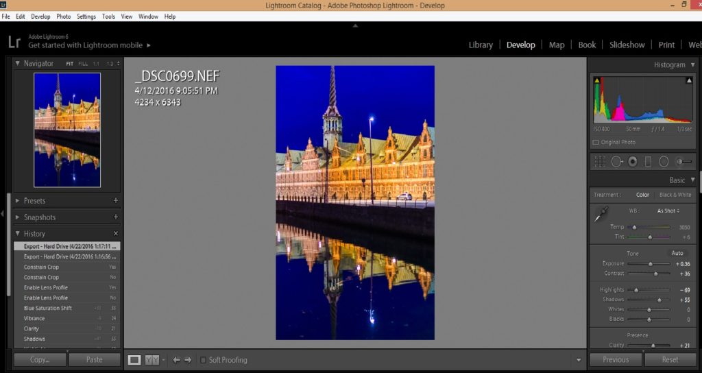
Night photography requires special attention during post-processing. Because long exposure times and high ISO sensitivity settings tend to introduce digital noise (random errors in the brightness and/or color rendition of pixels in the image), it is important to pay careful attention to these effects while working in Lightroom, Photoshop, or other post-processing software applications. I find Lightroom’s tools to be very effective in reducing both sources of noise. In Lightroom’s Develop Module, play with the Luminance slider under the Noise Reduction tools area until the noise is just controlled, but not so far as to cause unrealistic rendition of color or sharpness. Note that some cameras also allow you to reduce high ISO noise and/or long exposure noise via menu settings in-camera. I tend not to use these tools because they slow down the shooting process, and their effect can be replicated easily in post-processing. Post-processing is also the time to adjust the color rendition and sharpness/contrast of the Milky Way or other stars appearing in the image to make these astronomical features really pop.
 This image of Pigeon Point Lighthouse in Pescadero, California combines many of the night photography techniques discussed in this post. The lighting here was tricky because the brightness of the lighthouse beacon was much greater than the available light on the foreground and background objects. Bracketing exposure helps in these situations. Buy this photo
I hope this post inspires you to make your own nighttime images. With a decent DSLR or mirrorless ILC camera, a relatively fast lens, and a tripod, every photographer can now be equipped to shoot in very low light.
Now it’s your turn. Please share your own experiences with creating low-light images by leaving a comment here.
Want to read more posts about photographic techniques? Find them all here: Posts on Techniques.


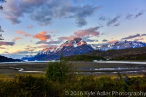 This HDR image of Lago Grey with its glacier and the peaks of Torres del Paine National Park in Chile was processed using Photoshop’s HDR tools. The colors appear unnaturally saturated and parts of the image (especially the tops of the mountains and the brush in the foreground) show some ghosting effects.
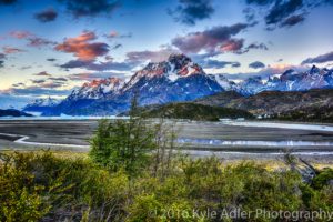 This version was processed using the Nik Collection’s HDR Efex Pro tools. The colors look much more natural and all parts of the image appear sharp and free from ghosting.


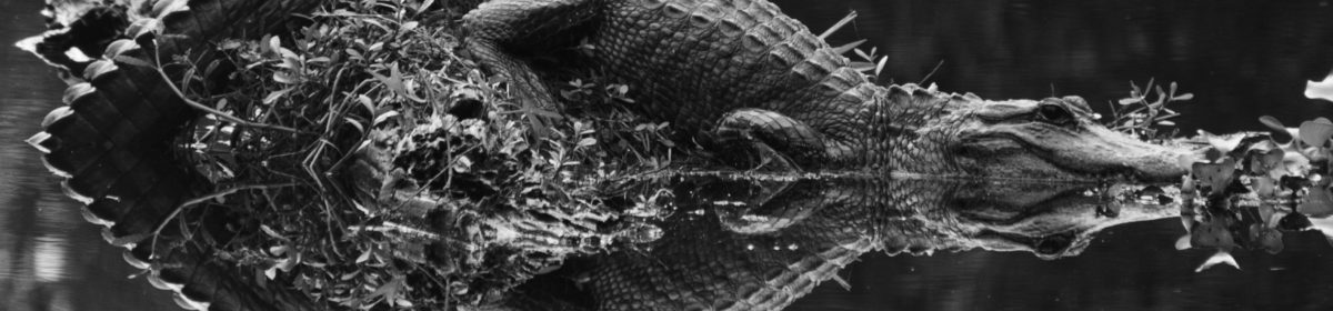
![I See a Red Door and I Want to Paint It Black [Encore Publication]: When a black-and-white image is better than color, and how to convert to B&W](http://www.to-travel-hopefully.com/wp-content/uploads/2016/08/LR-9763-1200x801.jpg)